‘Capturing Home’ Host and Photographer Divulges Creative Styling Secrets
Magnolia Network’s Amy Neunsinger looks for the subtleties when styling and shooting interiors, believing that a home should tell an authentic story. “I tell my story with light, and a stylist tells their story with little bits of humanity that lend themselves to the house we’re shooting.”
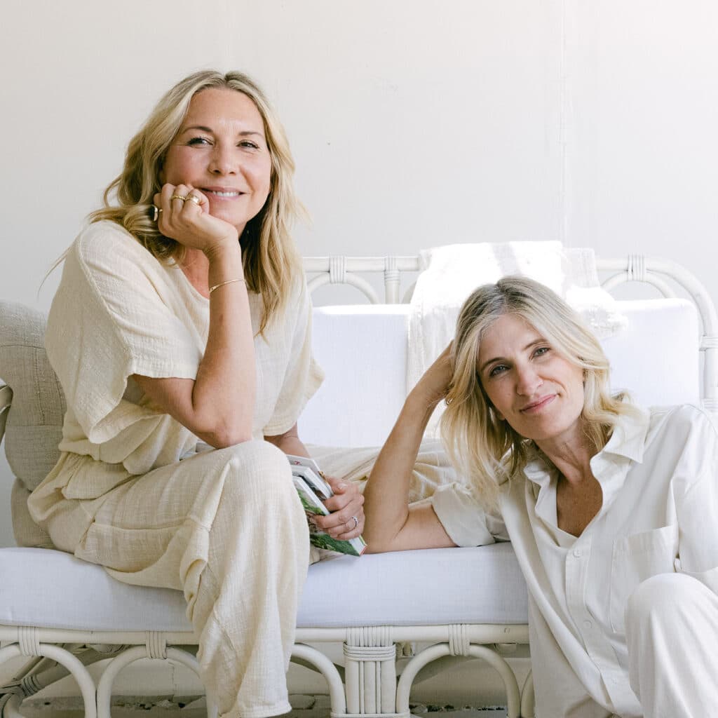
Earthy. Bohemian. Simple. Lived in. Sunshine-y.
No matter what space Magnolia Network’s Amy Neunsinger touches, her interiors seem to have these attributes in common. A first-call photographer and designer from Los Angeles, Amy designed and lives in one of the most photographed homes in California. She’s also the secret sauce behind many of today’s lifestyle brands and celebrities, including Joanna Gaines, Reese Witherspoon, Kate Hudson, Leanne Ford, Mark D. Sikes, Crate & Barrel, Shabby Chic and Target.
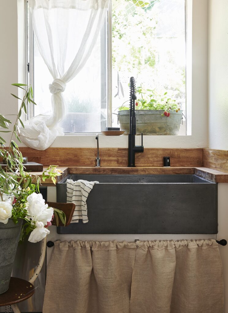
Because Amy is a fan of all things sustainable and organic, Native Trails products have found their way into many of her projects over the years. Most recently, that includes the pilot episode of her Magnolia Network television show, “Capturing Home,” in which she and frequent collaborator Kate Martindale remodeled a kitchen for a single dad using one of our farmhouse sinks.
But even before “Capturing Home,” Amy was very much on our radar thanks to her work with Leanne Ford and others. Having had the following chat with her, we’re also now happy to call her a friend to our brand.
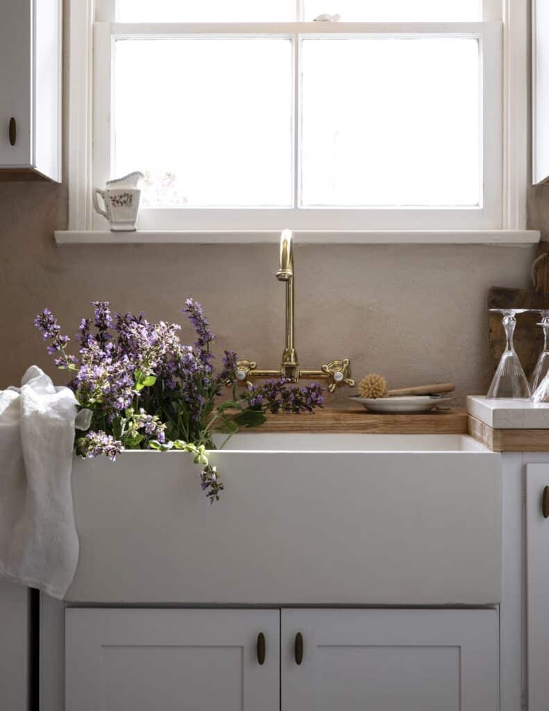
Photography: Amy Neunsinger
If your career was a pie chart, what portion of it would be photography and what portion would be design?
AN: I love pie! If there were a pie chart, I’d say 65% photography, 35% design.
That probably gets mixed together because you’re often doing both things at the same time.
AN: Especially with the show. Now that we have a show, the design portion of the pie is growing.
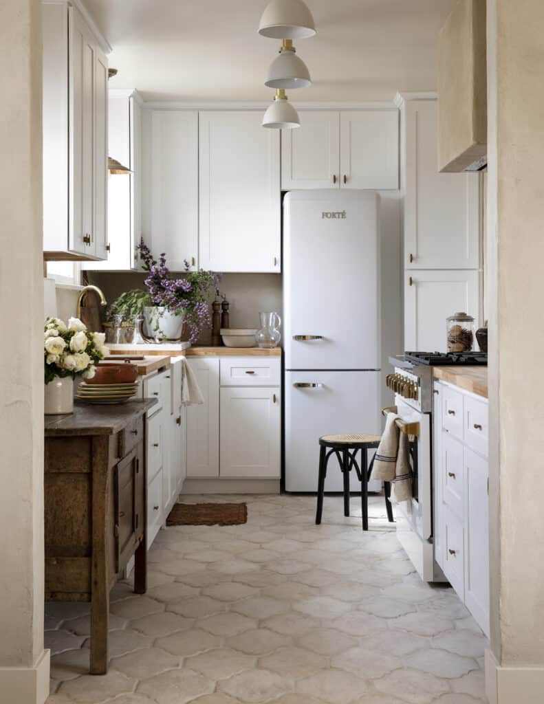
What’s it been like to have your own TV show on the Magnolia Network?
AN: It’s amazing. Kate and I both feel like we don’t even have a camera there. Because we’re just doing what feels like our job. Especially when we’re photographing. But sometimes, you’re like, “Am I alive? This is so hard!” When I watch an episode, I remember how tired I was. It’s real — the amount of work. We do everything ourselves.
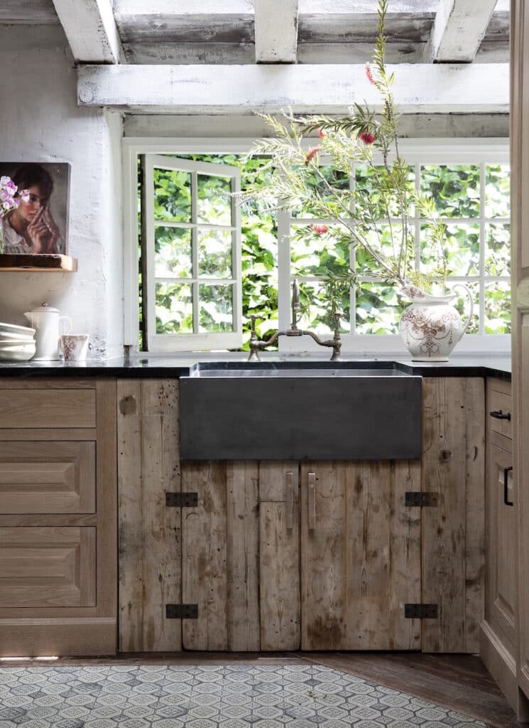
Photography: Amy Neunsinger
Sink: NativeStone Farmhouse 3018 in Slate
You shot Leanne Ford’s personal home in Los Angeles, which had a NativeStone farm sink. And you also had our farm sink in the pilot episode of “Capturing Home.”
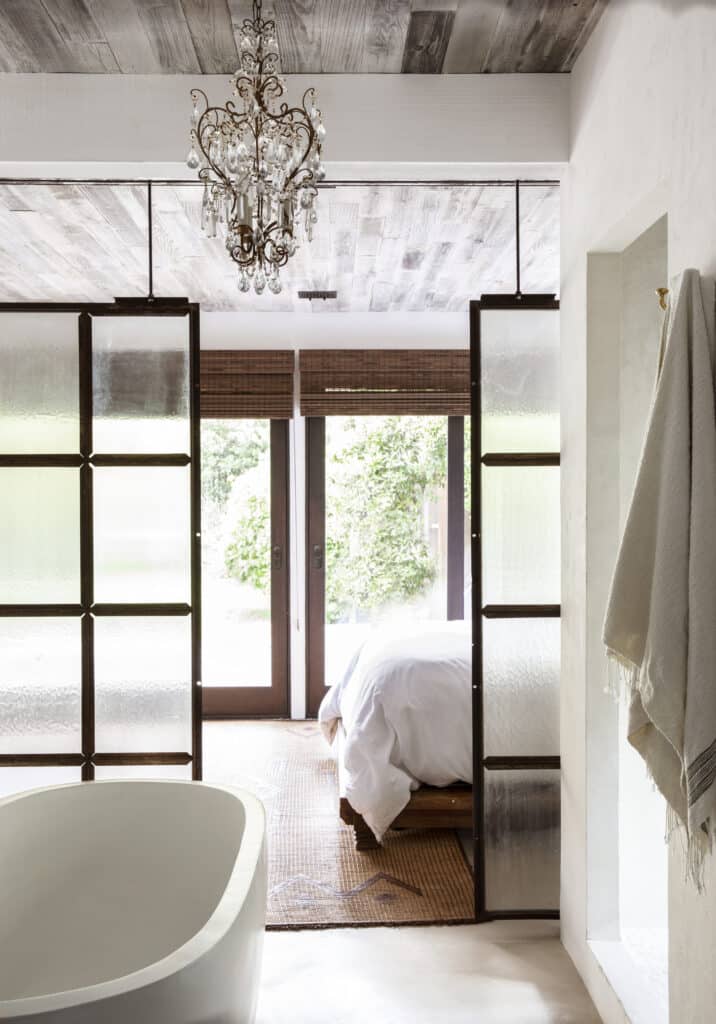
Product: Avalon 72 in Pearl
Photography: Amy Neunsinger
AN: I also used one of your tubs in a house I designed in Hollywood. I’m a huge fan. I use a lot of your products. And we used one of your NativeStone tubs in the “Rock the Block” house I designed with Leeanne as well. It’s my favorite tub. And we won that bathroom challenge.
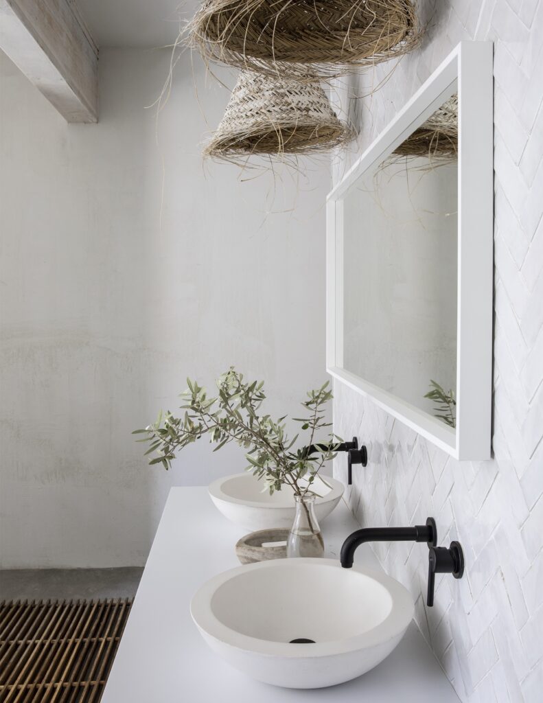
Morro sinks in Pearl
Photography: Amy Neunsinger
What’s it like collaborating with Leanne?
AN: You know, it’s so funny. We met about six years ago over a cheese plate at a mutual friend’s barbecue here in Laurel Canyon where I live. We were the only two people there eating cheese. And I’m like, “Oh, I love you! Thank you for eating cheese!”
We started chatting, and I had not seen her show yet. She was saying, “God, you know, I did a shoot at a house in Laurel Canyon years ago when I was a fashion stylist, and it really changed my view on interior design, and it got me really intrigued,” and she started describing my house! We had this kismet moment. She’s such a close friend.
I was just in Sewickley, Pittsburgh, shooting her new book. We have a mutual admiration club. I just love her. She’s such an amazing designer and human. And we both love cheese. In L.A., that’s rare.
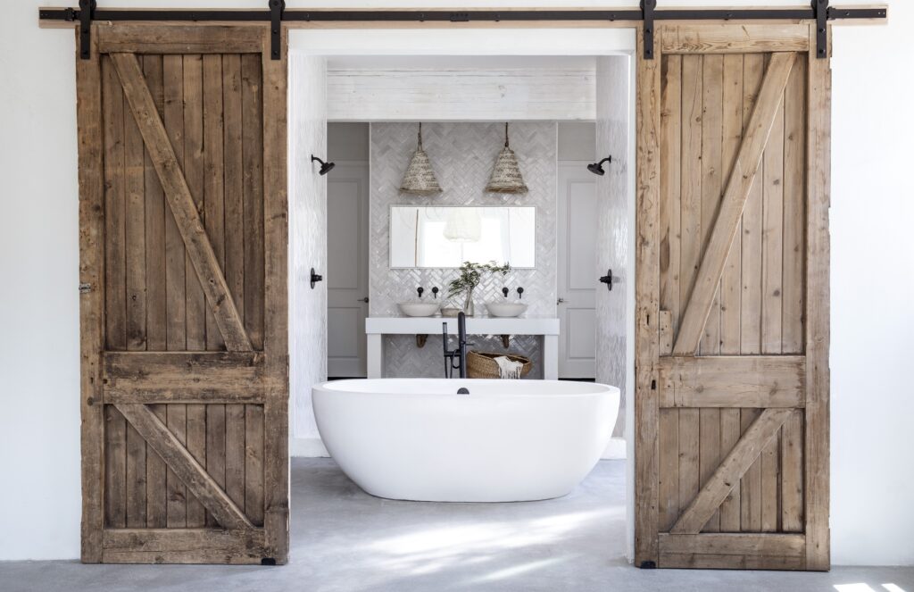
Avalon 72 in Pearl
Photography: Amy Neunsinger
How much has living in Laurel Canyon influenced your style?
AN: I bought my house before I was married so I have literally grown roots here. And my style has evolved because it’s the quintessential indoor-outdoor living. I have to come outside to go to the guest house/office. All the doors open to the yard on both sides. My garden is edible. I literally went up and got peaches this morning for me and my mom for breakfast. The design celebrates the outdoors, which is California living at its best.
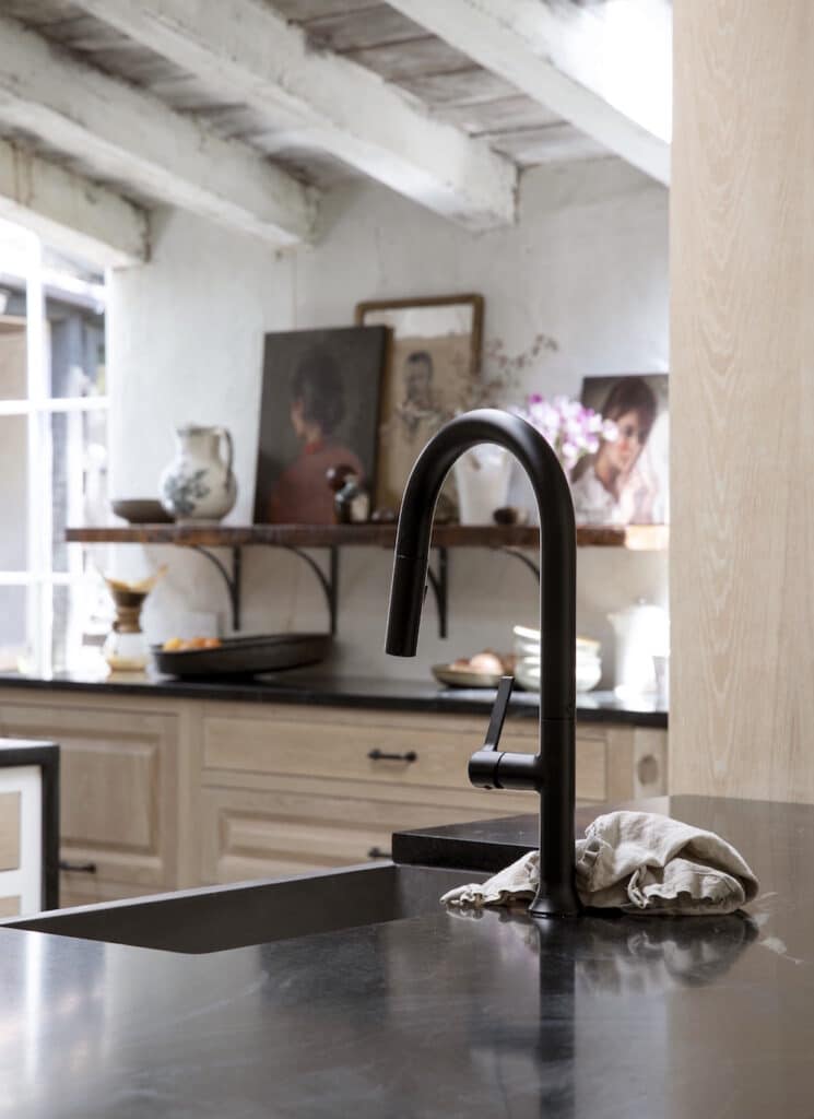
Photography: Amy Neunsinger
Sink: NativeStone Farmhouse 3018 in Slate
We have to talk about Kate Martindale. What do you think contributes to your creative alchemy with her?
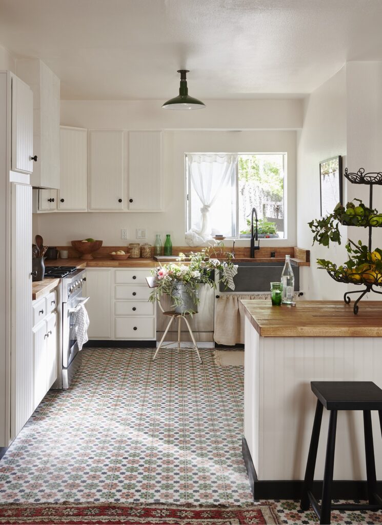
AN: We met as a photographer and stylist 17 years ago. Where I tend to pull back and see wide, she goes in. She has this unique ability to find the perfect complement to what I’m doing — meaning the vintage pieces that she brings to layer against my more austere background.
So, we complement each other’s abilities and talents really well to make a space feel relevant to our client, lived in and unique, because she uses so much vintage and so do I — all my furniture is vintage — she just layers it so much better than I do. We surprise each other with what we do.
Photography: Amy Neunsinger
Do you have any go-to tips to share when approaching styling a home prior to a photo shoot?
AN: First, if you’re shooting for a magazine, what season is it coming out? Because it’s important that the photos lend themselves to that. But I think my biggest tip is to let the house tell the story. Don’t overwhelm it with props and food and florals. Because the house is the star.
Also, you should feel like a human just walked out of the room, so you feel the humanity in a space. You don’t necessarily see the family photos, but you feel the life, the heartbeat, there. That’s important, so people automatically feel comfortable, and if it feels familiar.
What are some ways to create that human-just-walked-out-of-the-room vibe? Is it about pulling a chair away from the table, things like that?
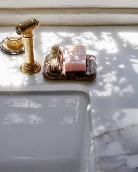
AN: Absolutely, it’s having a dish on a drain board that has water on it. You know, opening a window. Just these little things that are like, “Oh, yeah, that’s real. People do live here.” Because sometimes I look at homes in magazines and they’re so perfect that I can’t imagine myself in the space, so I turn the page.
There’s this quality of warmth that a photo needs to evoke. It could just be the quality of light coming in — a dappled low light coming across the floor — and you’re like, “Oh, yeah, my house does that somewhere.” So, it’s really trying to pull at the heartstrings of the viewer any way you can. Not overtly, but subtly.
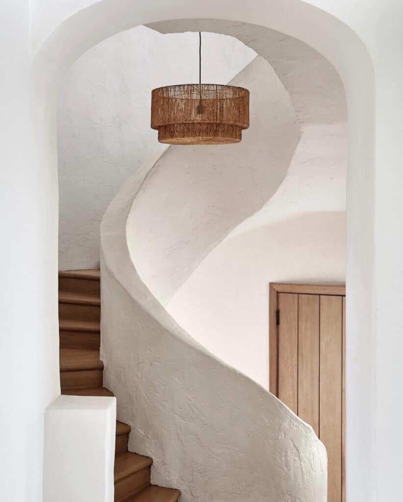
I do that a lot with light. Because we all respond to light. I tell my story with light, and a stylist tells their story with little bits of humanity that lend themselves to the house we’re shooting.
Before you photograph a space, are there certain things you always remove? Like, would you take away the coffee pot or take the television off the wall?
AN: I hate seeing a TV. Usually if you take it off the wall, then there’s this big, huge gaping hole with wires. I try to just avoid that angle in a room. You see the room, but the TV is cropped out. Everybody has a TV, I get it. I just don’t want to see it in a photo. I feel it’s a soul sucker. Regarding the coffee pot, if there’s a beautiful glass coffee carafe there, use it.
Photography: Amy Neunsinger
Do you have any styling pet peeves? For instance, how do you feel about turning books backwards on the shelf, so you don’t see the spines?
AN: I am not a fan of that on a bookshelf, because how do you find the book? I really believe in functionality. But in a beautiful stack, if the books are mismatched and some of them are faced with the pages out — if it feels real — totally don’t mind that. I also find that a floral arrangement in every room doesn’t feel authentic because you don’t live that way. 400 apples in a bowl? Feels like they’re just gonna rot.
The styling should feel authentic and real and not abusive to the amount that’s used. Sometimes less is more in telling a story. And a little bit of chaos is beautiful!
Like, Kate and I are so funny. We were scouting a house recently for a job. And there was the stack of magazines and newspapers and books on this kitchen island that was so beautiful. Like, we couldn’t even look at the house. It just felt like an art pile. It’s things like that, that are real, and that tell the story of who lives there. That is beauty to me, and to Kate.
Styling is very personal. I don’t think it should overwhelm a space. I don’t think it should be a calling card for the stylist either. I think it should just kind of go away and tell the home’s story. And that’s hard to do. It’s not easy because it’s not formulaic.
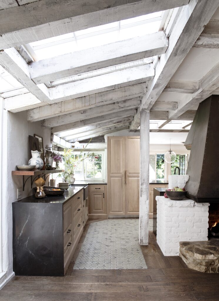
Photography: Amy Neunsinger
Sink: NativeStone Farmhouse 3018 in Slate
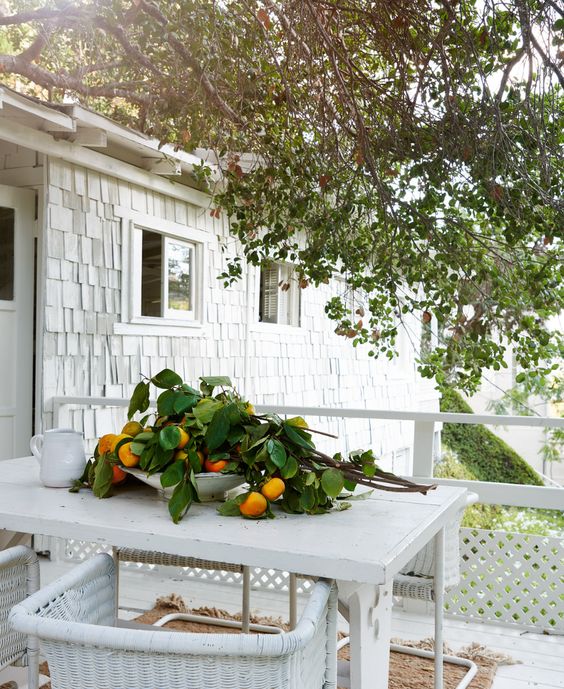
What you just said makes me think of one of the photos on your website. It’s an exterior where it looked like an orange tree had just been pruned and it looked like the branches had just been left on a patio table.
AN: Yes! Then, that abundance works. But I just hate waste in anything. So, yes, I think that is a pet peeve — the TV and waste.
You said you like to tell a story with light in your photography. How do you do that?
AN: Every photographer tells the story differently. I feel like my job is to tell the home’s story and how it’s situated on the property. I follow the sun, and I tell the story of the house that way. I do not light the interior; I let that story be told by how it’s situated on the land with the sun coming in.
That’s just my process. I feel like it’s authentic. I feel like it really celebrates the intention behind the design. I’ve been fascinated by light since I was little. It’s how I tell my story. There’s one sun; there’s one source. And it’s so funny, on the show, our DP was watching me light the stills, and I then started lighting for the motion as well. He’s like, “Wow, light must struggle.” And I said, “Yes, light must struggle,” because it doesn’t come in clean through a window.
It comes in through atmosphere, through telephone poles, through trees, through cobwebs. And that itself is a story that gives you a sense of space.
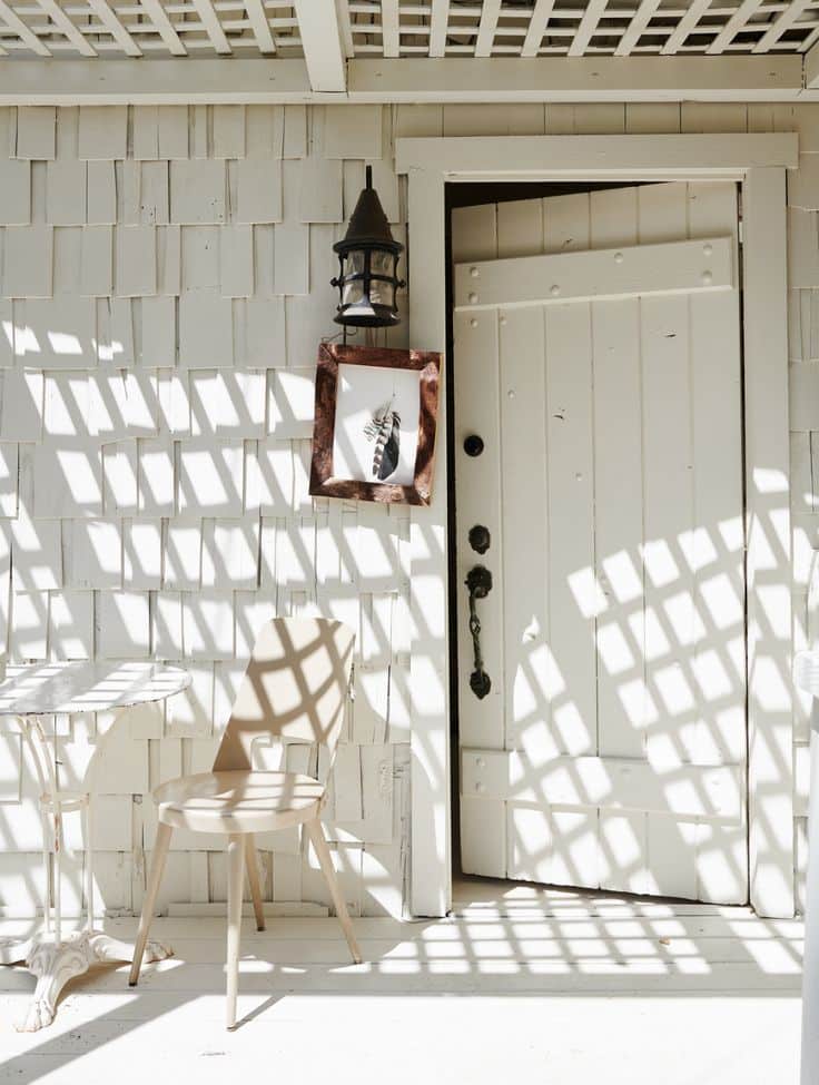
“Light must struggle” — love that.
AN: And it does. It does not come in directly. And sometimes when it does, you tell that story. So then you understand, “Oh, there isn’t a tree in front of this window? Yeah, I understand where this room is.” Or, “Are we upstairs? In upstairs rooms, the trees are thicker.” That’s how I do it. It’s not right or wrong. It’s just my way.
On your Instagram, you recently said a quote by Ralph Waldo Emerson sums up your philosophy of design. It’s that “The ornament of the house is the friends who frequent it.”
AN: Yeah, my big philosophy is a happy home is a happy block is a happy town is a happy city. So if you are happy in your home, and you share it, then that pays forward going outside your door. So it’s how you make people feel. If I feel good, and I share it, then anybody who comes into my home hopefully feels the same way. And they go out into the world trying to do the same. If you’re happy, then you have house pride, and it’s shared and it’s paid forward.
Three interior designers who inspire you the most?
AN: Oh, my gosh, I have to say my friend Leanne. Because she’s so brave. And she makes mistakes. And she calls it out. And the rules are that there should be no rules; I love that philosophy of hers.
And then on the opposite end of the spectrum is my friend Mark Sikes, who is the classic American designer, who’s just celebrating everything that America has had and has now. He’s such a lovely human. He’s so kind and his designs are so happy. And every time I walk into one of his rooms, I just feel happy.
Okay, and a third! I mean, I have so many! Like Axel Vervoordt for restraint and Elsie de Wolfe for her quotes.
What is your earliest design related memory?
AN: Well, I grew up with a single mom. We never lived anywhere for very long. So from an early, early age, we moved around a lot. I thought, “When I have my own house, I am never going to move. I’m going to design it to last.” So that is why I’ve lived in my house for 26 years. “Designed to last” really imprinted on me.
Enjoyed our interview with Amy Neunsinger? You may want to read our interview with Leeanne Ford.
