Tour a Chic Modern Farmhouse
Kelle Contine Interior Design Takes Us for a Turn Around This Masterful Austin Home
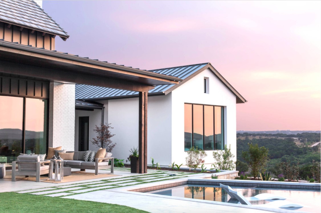
The annual Rough Hollow Parade of Homes showcases the newest trends in construction, building design, interior décor, and landscape. The 2017 event provided designers Erin Judge and Nicki Perez the opportunity to create a unique luxury spec home. Judge and Perez of Kelle Contine Interior Design aligned on a plan for a modern farmhouse with a twist. They drew from a limited color palette, dialing up interest with raw materials, bold tile, textural wallcoverings, sculptural lighting selections, and concrete sinks and bathtubs by Native Trails.
“Architecturally, the exterior of the house spoke to that modern farmhouse look and feel. We wanted to reinforce that in the interior,” says Nicki. “And since we knew the home would be going on a tour, we were constantly thinking about what people would want to see. What would be interesting and new?”
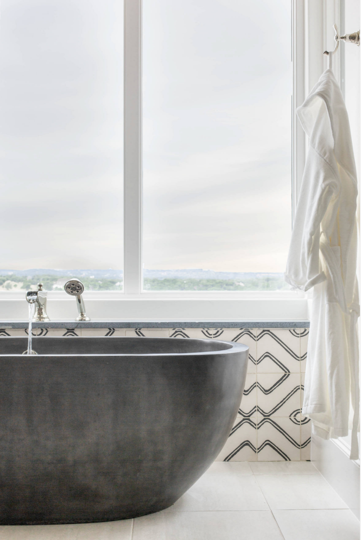
When they saw the sleek Avalon bathtub handcrafted from NativeStone they knew it was a must for the home. “The Native Trails freestanding concrete bathtub was one of our first selections and a big initial influence,” says Nicki. “A lot of the home was designed around its contemporary but also rustic and raw look. Everything just fell into place after that.”
This project, a tightknit collaboration between the builder, architect (Cornerstone Architects) and the designers, ultimately included four Native Trails products. So, of course we had to ask for a tour.
NT: Give us the rundown on the overall aesthetic you were going for.
EJ: We used a lot of natural-looking products and kept the overall material palette very clean and simple versus taste-specific. We also incorporated a lot of polished metals to keep it from feeling too rustic. Similarly, we used geometric patterns to create a backdrop that would offset the monotone tub and concrete sinks. We tried to mix in a lot of textures without necessarily adding color, since it is a parade home and a spec home that eventually was for sale.
The house stands on top of a pretty spectacular hill with some amazing views of the lake and hill country around it. We also wanted to make sure we didn’t take away from the beauty of the site.
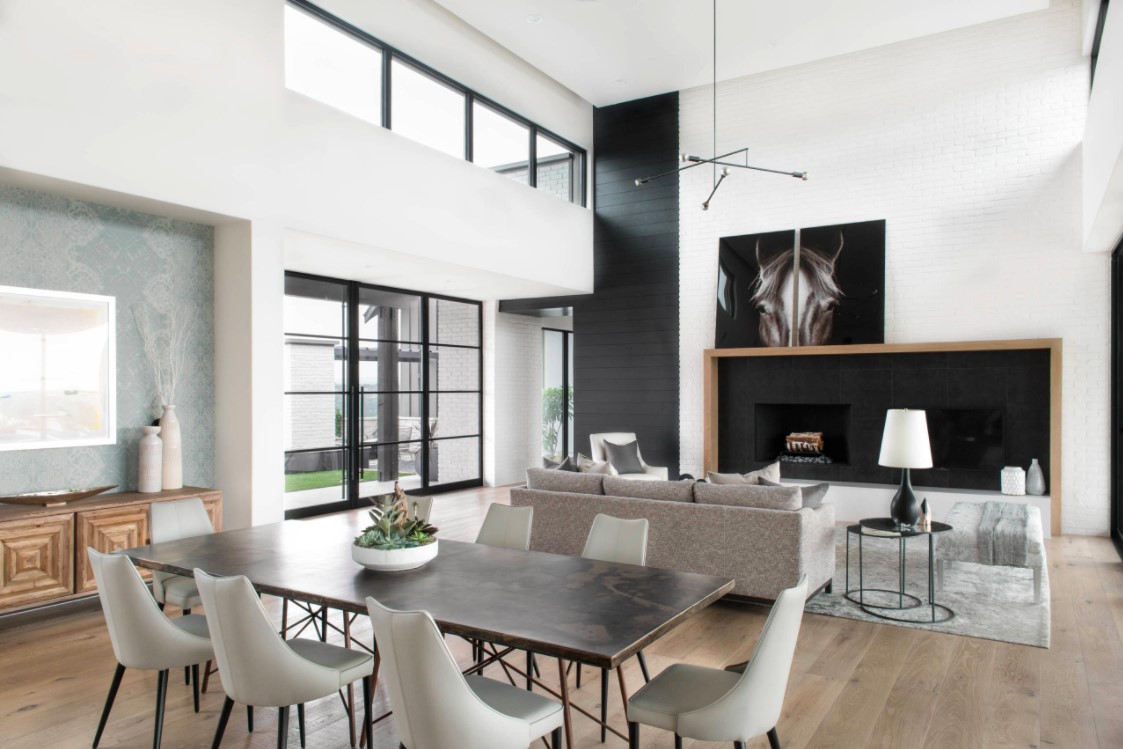
NP: In the master bathroom, for example, we used natural soapstone countertops, the concrete tub and cement tiles. We wanted to bring those natural elements to life. That’s something you see throughout the entire house, which is why there ended up being so much use of the Native Trails products. The concrete sink was a feature in most of the areas we put it in because it helped tie our vision together. Painted white brick also speaks to the quintessential modern farmhouse style. We incorporated that in the great room on the fireplace wall and mirrored that within the kitchen as our backsplash. It transitioned from the great room to the exterior seamlessly.
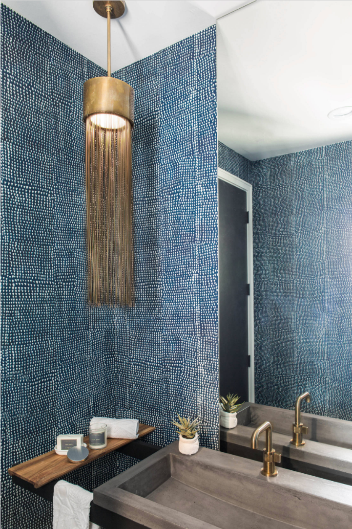
NT: Tell us about the powder room with our concrete trough sink and that gorgeous wallpaper.
EJ: The vanity’s steel bar design was one of Tommy [Roberts, owner of Triton Homes]’s brain children that came about when we were first doing plumbing selections and saw that Native Trails sink. Tommy wanted to do something a little bit different and not necessarily build a whole cabinet around the sink. On our end, we wanted to offset that industrial and raw element with a little touch of softness, with some brass. Also, it’s a powder room, so we wanted some pop and wow in there. We got the wall covering from St. Frank to add color and texture and still fit within that raw look.
NP: We get a lot of questions about that wall covering. That was one of the things that we were so drawn to when we were selecting finishes. It doesn’t have any actual texture to it, but visually it does, and we loved that it looked very vintage, linen-y, textile-like. We’re big fans in our office of doing something unexpected in the powder bathroom. We pushed for that wall covering. We pushed very hard. It ended up doing so much for that space.
NT: That brass light fixture is pretty fantastic.
NP: The light fixture is from Arteriors. We knew that we were going to do these really great Brizo plumbing fixtures in there that have a vintage gold finish, and so it just fell into our laps. It was the right size and the right finish. When we fell on the final idea, the architect had drawn an asymmetrical sink location, and we really liked that and wanted to balance the tall mirror with some kind of feature light in that space. Arteriors is one of our go-tos for feature fixtures, so we were really excited to get to showcase that piece.
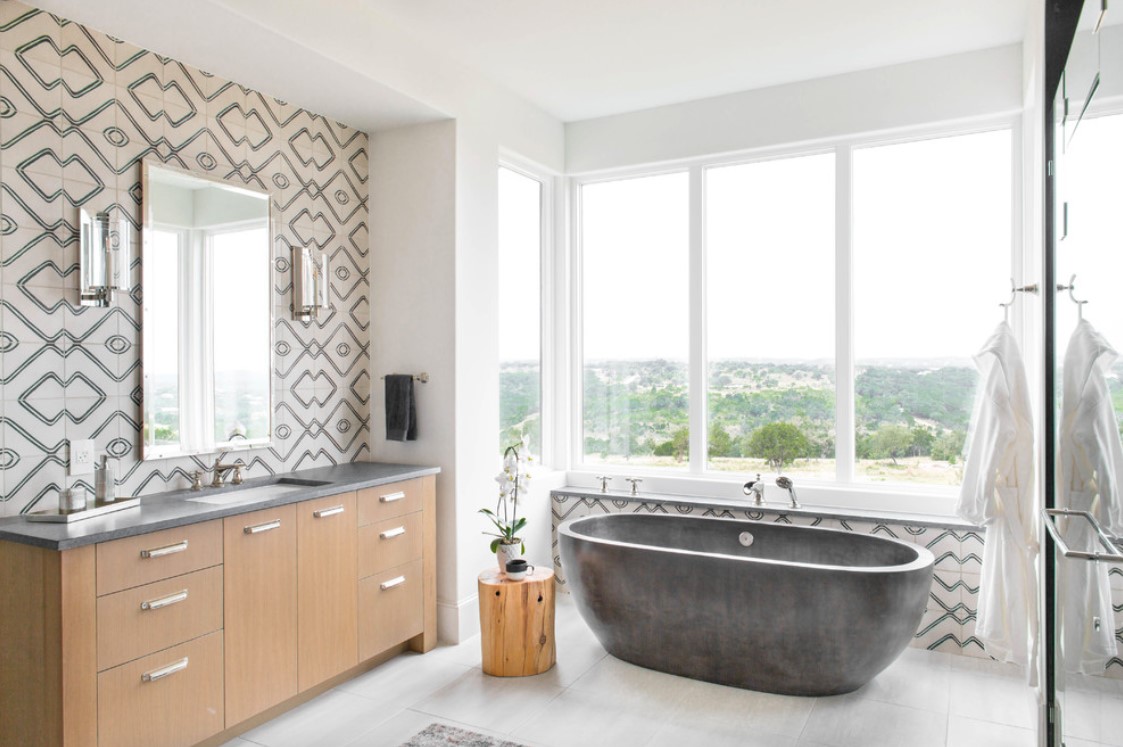
NT: Let’s talk about that master bathroom—what can you tell us about that tile?
EJ: That tub was our kicking off design point. The way we start a lot of these projects is with a good amount of imagery and inspiration from Pinterest, Houzz and other projects we’ve found online. There were a couple of bathrooms that we really liked with natural wood and clean secondary finishes. The floor in this bathroom is just a solid gray tile. We brought in little pops with geometrics on the backsplash and a faux Persian rug. That tile was submitted to us by a vendor based in Dallas called Exquisite Surfaces, https://xsurfaces.com/#/ and we just fell in love with it right away. We were already down that black, white and wood path for the rest of the house so it fit in really, really well. You have to put that tile in a large field to get the pattern effect of it, and it really popped that dark concrete tub.
NP: One of the things that we were most drawn to about that tile is that although it’s patterned it’s also a very elegant pattern. A lot of the cement tiles produced these days have sharp lines that are very geometric and triangular, or on the other side, they’re very floral and soft. However, this cool, contemporary pattern is a blend of both.
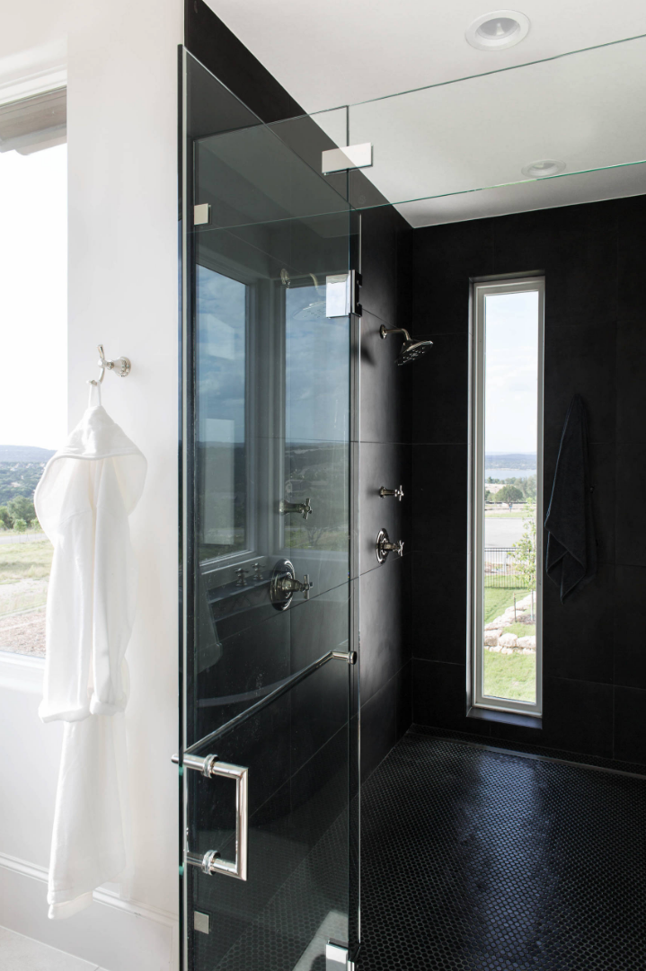
NT: How did you decide on an all-black shower?
EJ: To counteract all that pattern, we wanted to keep the shower very simple and add some drama, tie back in that darker tub and some of the black elements. It’s the same tile that’s on the floor, just in a different colorway.
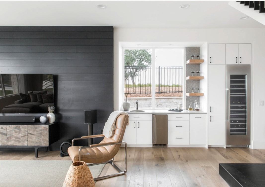
NT: Where’s the wet bar located in the home?
EJ: It’s in what’s meant to be the TV-watching-slash-game room. The bar is a secondary space that you can see from the kitchen area, so we wanted it to tie in but not be distracting. There’s a full-height wine fridge, a couple of floating shelves and a really fantastic metallic backsplash—but just a few feet of it—to give that room some life.
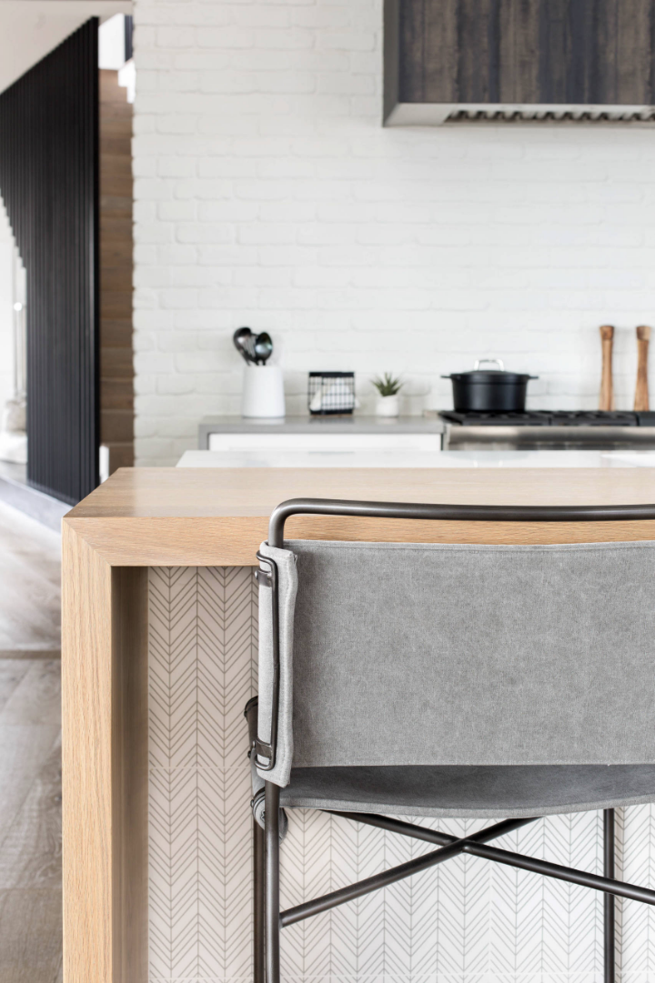
NT: Is that tile or wallpaper on the face of the kitchen island?
NP: It’s a ceramic tile by Erin Adams. What we liked about that tile is that gave us a little bit of unexpected pattern, but it was very subtle.
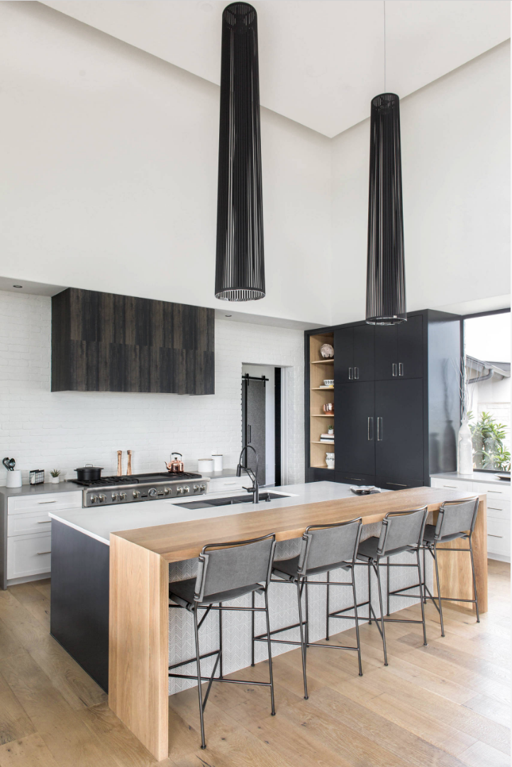
NT: The range hood is very unique. What is the material?
EJ: The range hood went through several iterations. We knew we wanted some sort of very large-and-in-charge feature there. The finish is a vinyl wall covering that we selected to mimic the look of blackened steel, but it actually has a little more texture and variation to it. It was a really great and cost-effective way to do that vent hood.
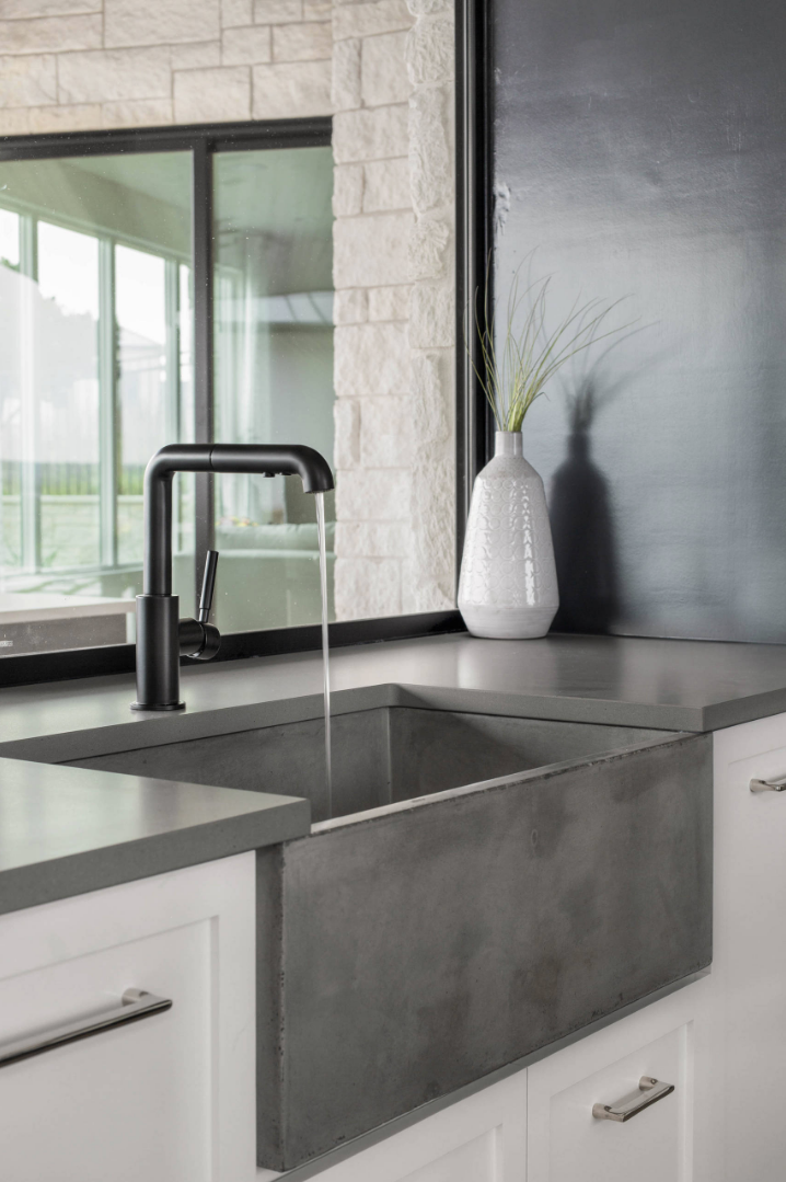
NT: You also used one of our concrete farm sinks in the kitchen.
NP: Yes, at one of the perimeter counters, there’s a prep sink that’s a gray apron-front sink from Native Trails.
NT: And you certainly didn’t miss an opportunity to make an impact with statement lighting over the island.
NP: That fixture was probably one of our most-discussed selections as a team because those ceilings are about 19 or so feet high. That was challenging because the scale needed to be just right. Because it’s in the kitchen and one of the first things you see, we also wanted it to be a statement fixture. We found this one from a company called Pablo Designs. It came in three sizes, and we ordered the largest—it’s six feet high. We had the height for it. The black lines are fabric so they have a little bit of movement to them. When the HVAC is running, it adds both the softness and vertical geometry that we have elsewhere in the house.
Photography by Reagen Taylor Photography
Native Trails sinks and tub purchased from The Bath & Kitchen Showplace in Austin, Texas
