How to Get White Right in the Kitchen and Bath
An Interview with Designer Kishani Perera
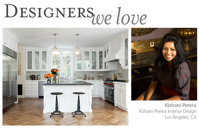
When Kishani Perera was a teenager, the eclectic bedroom she created for herself landed in a local newspaper feature about cool teen rooms. Today the Los Angeles-based interior designer receives press that is much grander. Think Elle Decor, Lonny and HGTV Magazine; but the subject is the same: Kishani’s otherworldly talent for pulling together layered spaces filled with whimsical accents, statement tile and vintage furniture. She has to divorce herself from a lifelong compulsion to collect the latter—read on to hear why.
As actor Molly Simms, a repeat client, wrote in the introduction to Kishani’s gorgeous book Vintage Remix, “She has the ability to see the hidden beauty in almost anything. Maybe a piece simply needs to be sanded or stained, recovered, updated, painted, or polished. Maybe it’s a modern piece but would look interesting with an antique finish. Or maybe it’s a French-country design but would look rock-and-roll if painted a bright color and glazed. What she has is vision.”
More celebs Kishani has designed for: Rachel Bilson and Hayden Christensen, Michael C Hall, Gary Oldman, Kaitlin Olson and Mary Lynn Rajskub.
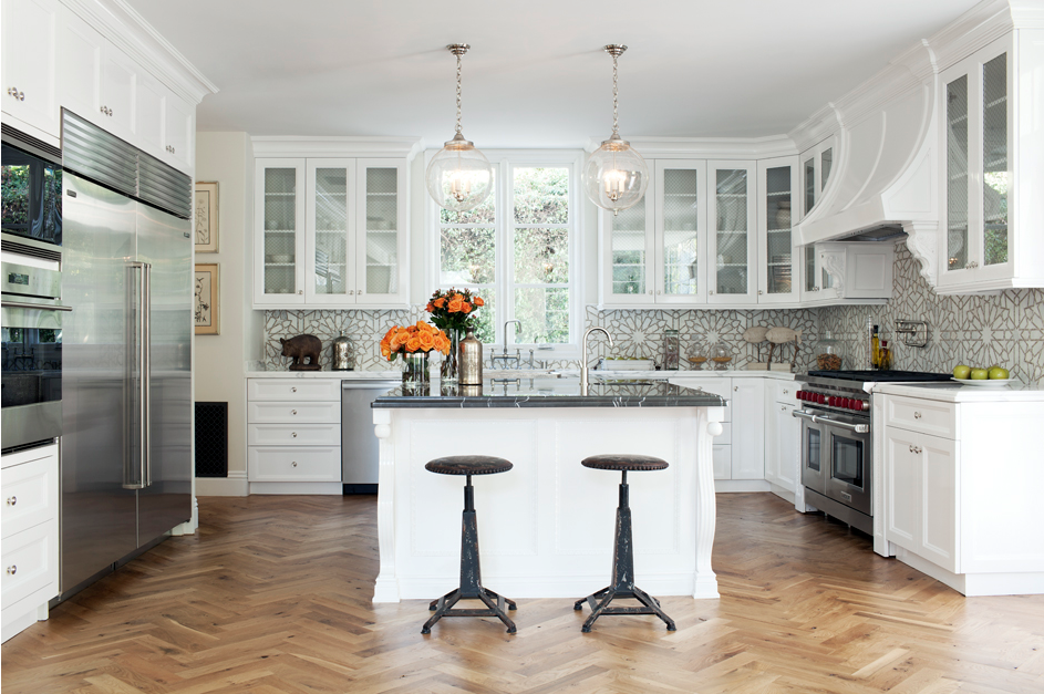
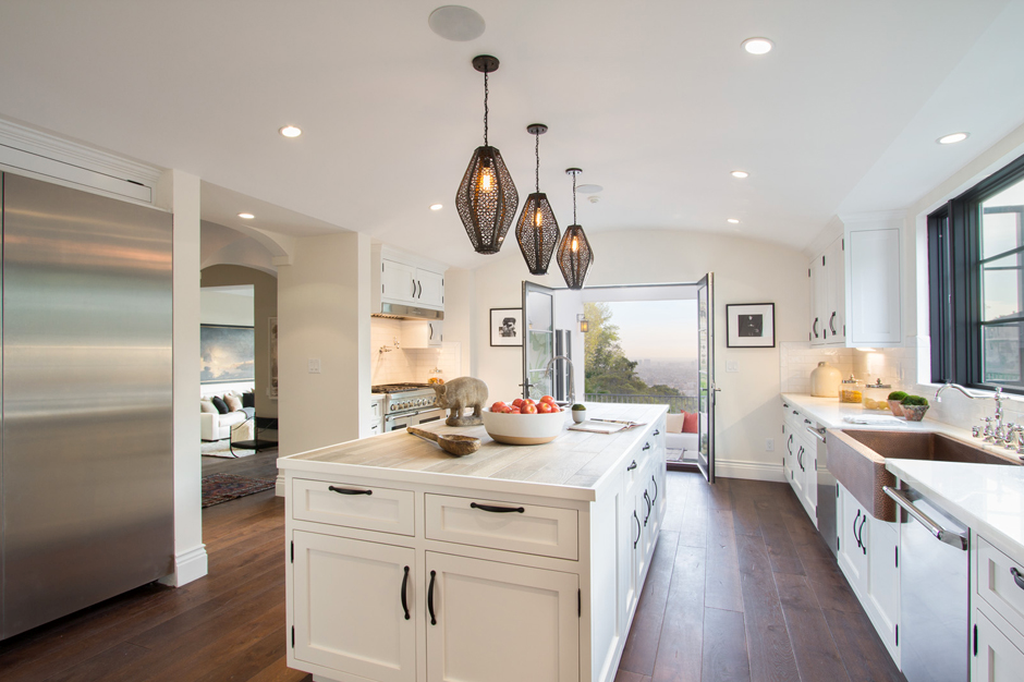
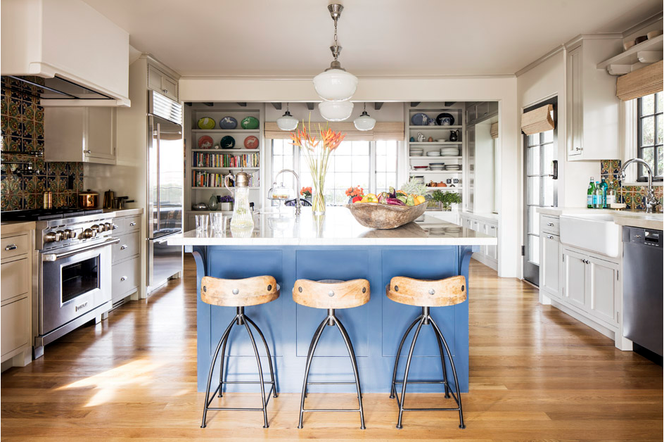
Last year Kishani told Better Homes and Gardens that the trend she saw on the design horizon was the use of white in homes again. Since Native Trails now carries the first white sinks and bathtubs in our 20-year product history—those in the NativeStone® Pearl finish—and Kishani is the mastermind behind one of our favorite non-boring white kitchens ever (pictured above and below), there is no one better than Kishani to tell us how to get white right without putting anyone to sleep.
NT: Do you see that white in home design is a trend that’s playing out the way you predicted?
KP: Definitely. I’m starting to see it everywhere in my world, and I feel like it’s getting more mainstream. Whereas white used to be seen as a non-color, and going with it used to be seen as a non-effort because you clearly weren’t creative or didn’t put any thought into it. Now it’s clearer that you’re going for a certain look when you select white. Trends are ever-changing though. I don’t really stick to them too much because I just do what I like and what’s right for the client.
NT: Let’s say you have a client who is afraid of color. How do you convince them to add interest otherwise?
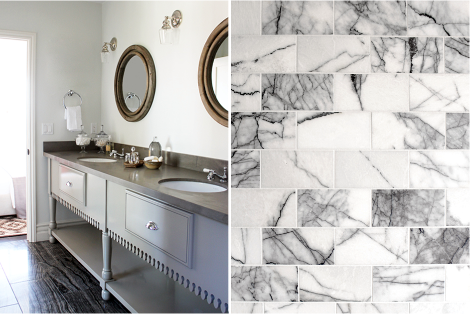
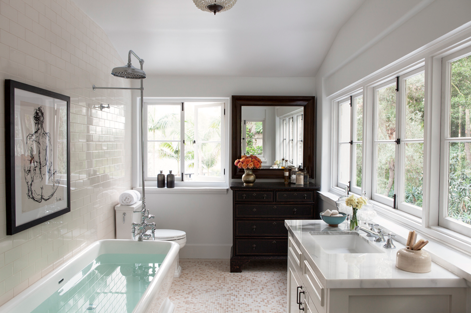
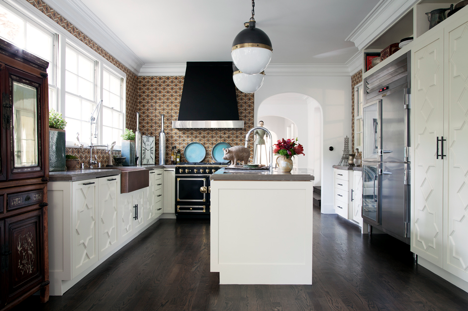
KP: With layering and textures and by adding as many unique details as you can even within that monochrome palette. Believe it or not, I’ve done a lot of houses that are very, very neutral. For me, it’s about bringing in interest through a beautiful grain on the wood or a marble with really amazing veining, if those elements happen to be in the room. Or if it’s a room where the materials are upholstery and wood, maybe we bring in a light wood coffee table with a great carved detail. It’s just about keeping it interesting for me. If there’s nothing about the room that’s unique or has personality, it’s way too boring for me. Even if a client wants that, I can’t do it. Luckily none of those people ever call me because if that’s their vibe I would obviously not be their girl.
NT: What are your design calling cards?
KP: I am drawn to texture and color and a layered look, to pieces that have interesting features. I’m definitely not a minimalist. Even when we do contemporary houses, I’ll add in pieces like a Native Trails sink that has some detail, a handmade quality to it. Everything I do has to have warmth. In my own house, which I’m designing now, I plan to put one of your 30-inch hammered copper sinks in the kitchen. I’m also thinking about a smaller one in one of the bathrooms as well.
NT: Oh, what’s the plan for your own home?
KP: I’m trying to do a woodless house—no wood—because I’ve discovered I have a really crazy sensitivity to mold. Even new wood has little bits of mold in it. I’m conducting a bit of an experiment to see if it makes a difference in the house so I’m doing everything concrete and metals—organic but not porous. I usually use concrete more in elements rather than everywhere. But the way I’m doing it at my house it’s going to have a lot of warmth, and I’m doing a lot of white concrete. Floors, kitchen, everything—tons of it.
NT: You can’t even use wood furniture?
KP: I may use a few pieces, but I have all these amazing antiques, which is so depressing because my doctor is like, “Get away from all antiques and construction sites.” And I’m like, “My entire life is what you just described,” and he said, “Well, that’s why you’re so sick.” I can’t even do the flea market anymore, which is my life. I’m trying to stick to newer pieces that are vintage-inspired because I can’t do actual vintage. It’s been an interesting year of discovery.
NT: What kind of projects and requests do your clients most often bring to you?
KP: It’s changing now. It used to be a lot of decorating—furnishing a space. And now it’s more like, “Can you build us a house?” Which is great because that’s where my love is being directed right now. I get so much more satisfaction out of seeing something built from the ground up. Every part of it has our touch to it, and then we get to furnish it, too, which is cool and amazing. I see that as the evolution of my career—going more toward building and the construction side of things.
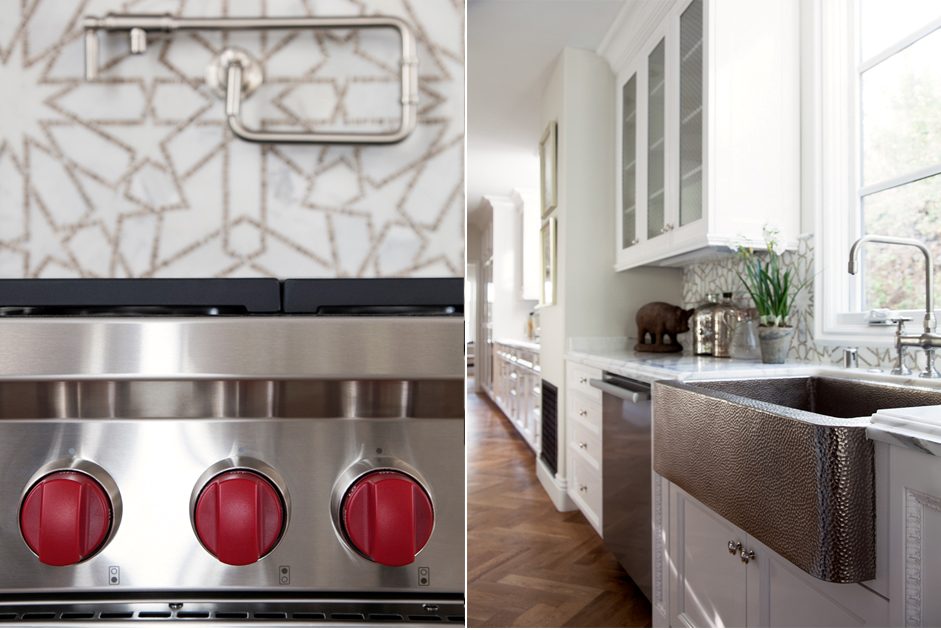
NT: Let’s talk about a white farmhouse sink. How do you use them in your designs?
KP: I use white farmhouse sinks all the time because they are classic and really work in so many different style homes, whether it’s a traditional house or colonial or Spanish.
It’s really versatile and transitional so you can also use a white farm sink to bring warmth to a colder modern kitchen. Farmhouse sinks have clean lines so they still work in that context. They’re just something that everybody loves. I’ve yet to meet a person who doesn’t like a farmhouse sink.
NT: Do you like to mix different shades of white in the same room?
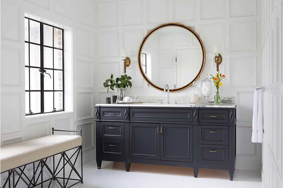
KP: I’m definitely becoming more of a fan. I used to be like, “White and cream! God, no, it’s terrible!” But it’s sort of like if you add enough shades of white it works. If it’s all white with a little bit of cream, then for me it kind of looks like a mistake, like you’re trying to match it but you couldn’t quite get it. So I think it’s best to take it to the next level by adding multiple shades of creams and whites so that then it’s clear that this is the intention.
NT: Is the trick sticking to all cool whites or all warm whites, or can you mix?
KP: Good question—I actually like to mix them, but I definitely tend to use more warm whites.
NT: One of the things you do best and most fearlessly is tile selection. What are your secrets and your favorite sources?
KP: The natural reaction with tile is to do something safe and neutral because it’s there forever, and clients can’t change it. I did maybe one or two houses like that, and I was like, “This is so boring! I hate it and don’t want to do this. It isn’t fun for me, and it isn’t me, and I don’t think it’s what the client wants from me.” It took me a minute to get that, so now I bring into building the same thinking I bring into decorating, which is to always add pattern and layers and textures. And then I was like, “Oh yeah, that looks like you! I love this bathroom or kitchen.” Really every element is important—the faucet is really important; the sink is really important. They all have to be well-chosen in order to give spaces the character that I think all of the kitchens and bathrooms I do have.
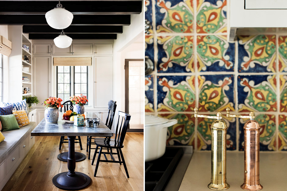
As for the tiles I choose, I really like Clé Tile. I like mosaic tile—especially super Moroccan-y beautiful tiles. There are so many good places. New Ravenna is a favorite vendor.
NT: Any go-to white paint colors?
KP: Yes, I pretty much always use Benjamin Moore Decorator’s White because it has a little bit of that warmth to it, but it’s still very crisp. I have used other colors, but that is my go to without a shadow of a doubt.
Read about more Designers We Love.