Bond Design Company’s Jennifer Chipman Takes Us Inside the Dreamiest Chalet Style Home
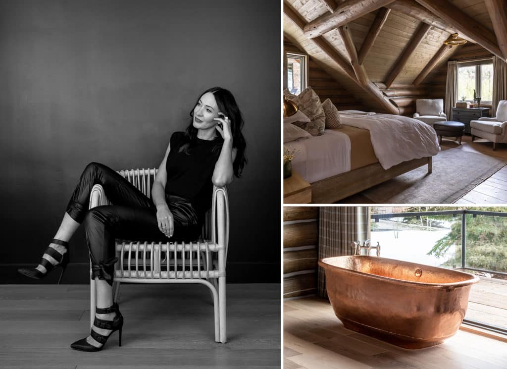
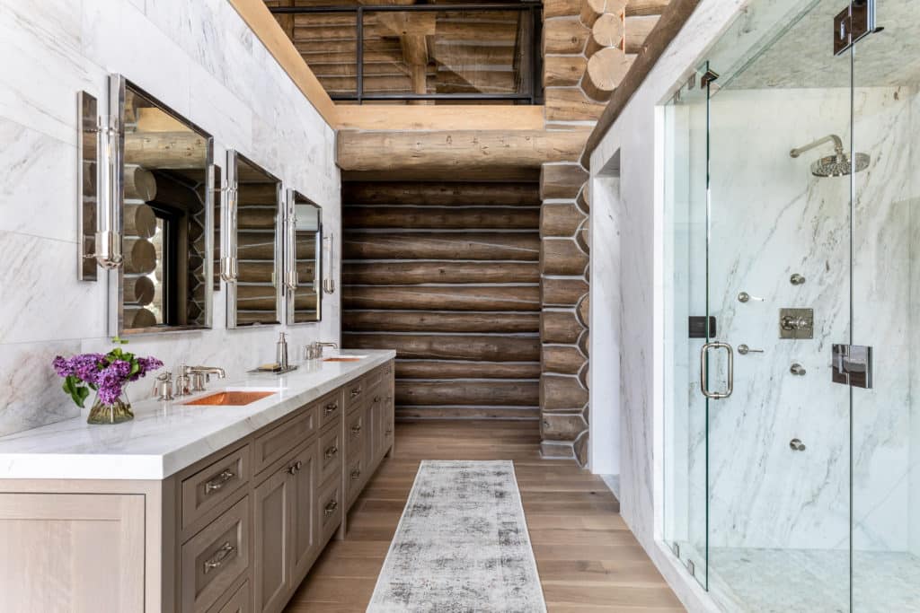
Every so often a design project comes along that changes the entire trajectory of a designer’s career. For Jennifer Chipman, it was a luxurious, off-the-grid log cabin in Kamas, Utah. Not only did it end up being a wonder of chalet-style design but it inspired Jennifer and the home’s owner to form Bond Design Company — so named for the “bond” they built over the four years it took to complete the project. The home also inadvertently turned out to be a kind of showroom for Native Trails. Our concrete and polished copper sinks and bathtubs fit the desired aesthetic so much so that there are a total of eight Native Trails sinks and two tubs within it — not that we’re counting or anything. Jennifer’s fresh take on log cabin style also incorporates locally sourced timber, natural textures and oversized windows that capture the elegance of the surrounding mountain landscapes. Thankfully, she’s invited us into the woods and behind the scenes of this pivotal project.
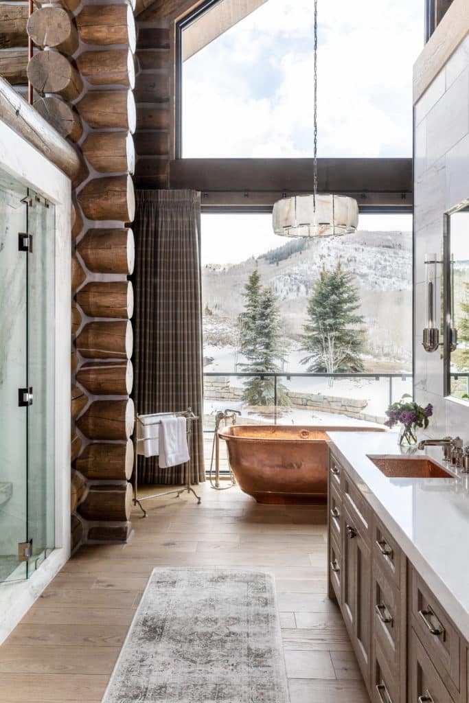
When we saw that log cabin, it was a complete wow moment for us. It also challenges our definition of a log cabin since it’s not exactly quaint. What’s the story behind this property?
Jennifer Chipman: There was an original cabin from the ’50s or ’60s that my client had purchased on a gorgeous piece of property. They wanted to remodel it and do a huge addition. It took about four years from start to finish. It was a major project and pretty complicated because they wanted it to be totally off grid and self-sufficient. There’s a whole solar field with solar panels, and it has its own well. So we had to have appliances that were compatible and a Tesla battery system. Even though the addition was big, modern and fresh, they still wanted it to have the charm of the original log cabin. We wanted it to feel really organic, kind of earthy, and also like there’s a history there.
Ah, it makes sense why you chose Native Trails products then, since they check the boxes for both sustainability and organic texture.
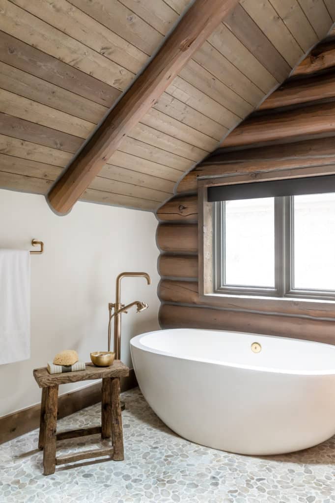
JC: Your products were literally the perfect products. I’ve been dying to use that copper tub and I was bent on using the NativeStone tub, too. I was like, “Yes! Here’s my moment.”
Can you walk us through which products you used where?
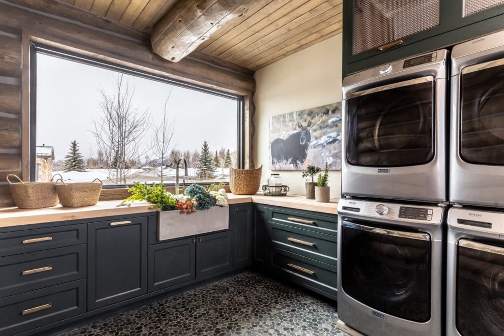
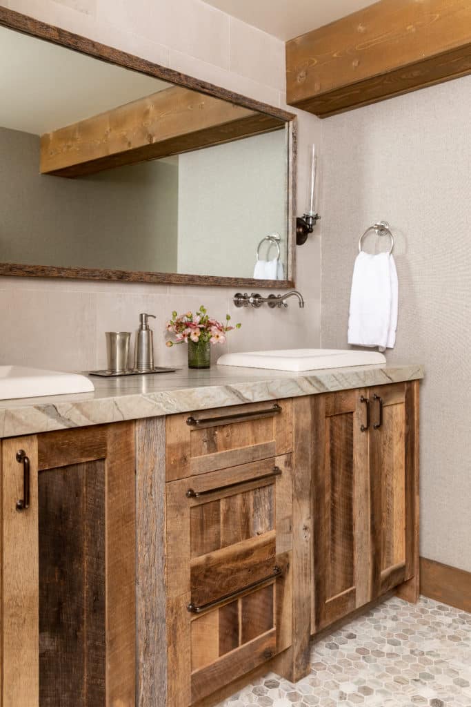
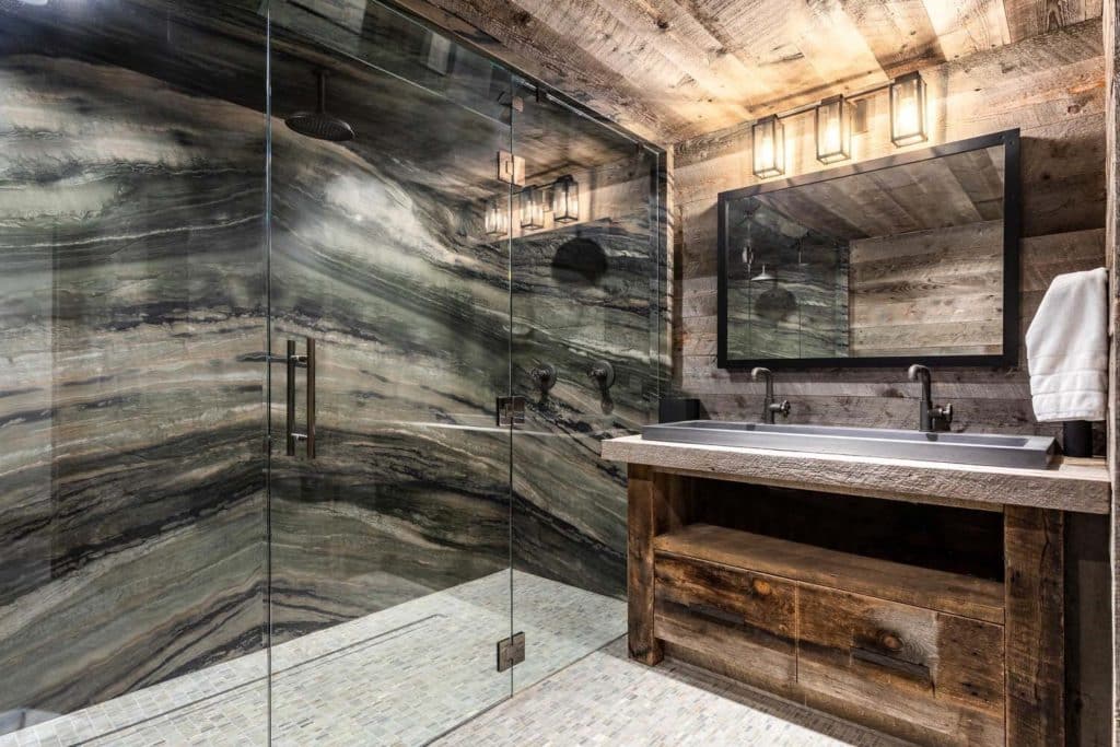
JC: So in the new primary, we did the Santorini hammered copper tub and Avila sinks. And in the original primary suite, we did the NativeStone Avalon 62 tub in Pearl. There are two guest bathrooms with NativeStone sinks (Montecito and Morro). The laundry sink (Farmhouse Double Bowl) is from you guys, and so is the concrete sink in the pool bath (Trough 4819).
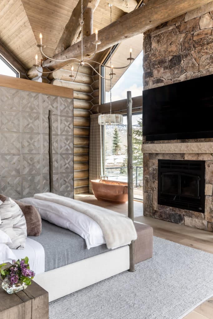
It turned out super luxurious. From your website, we see that your budget was almost a million dollars.
JC: That was just the budget for furnishing. The property is for sale right now for $24 million.
Oh! Why for sale?
JC: They’re an awesome client. They love to create, and then they’ll turn around and sell things and create something else. That’s what they love to do. Actually, Chelsey [Milton] ended up being my new business partner. We started Bond together because we had so much fun working on this project when I was with another design firm. She’s super passionate about design, too, and we got along so great. That’s why we even named the company Bond, because we’d formed such a great bond. It’s about that designer-client relationship. As a designer, it’s really important to me to catch their vision. It’s not my home; it’s theirs. So, I worked really hard to try to understand their dynamics and their vision and their aesthetic and bring that dream to life for them.
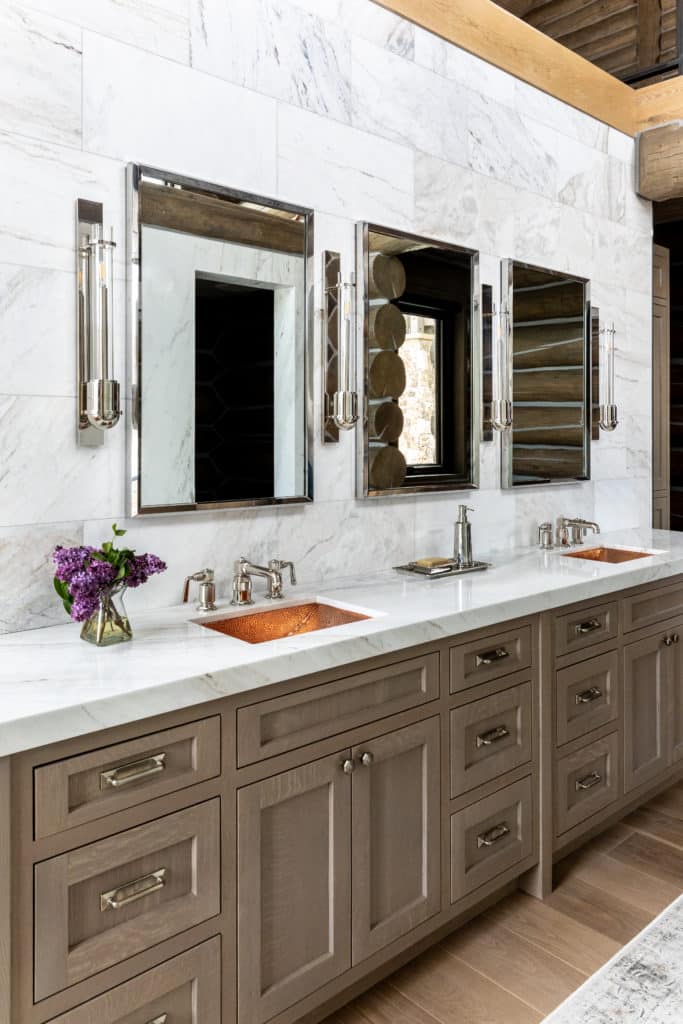
Avila sinks in Polished Copper
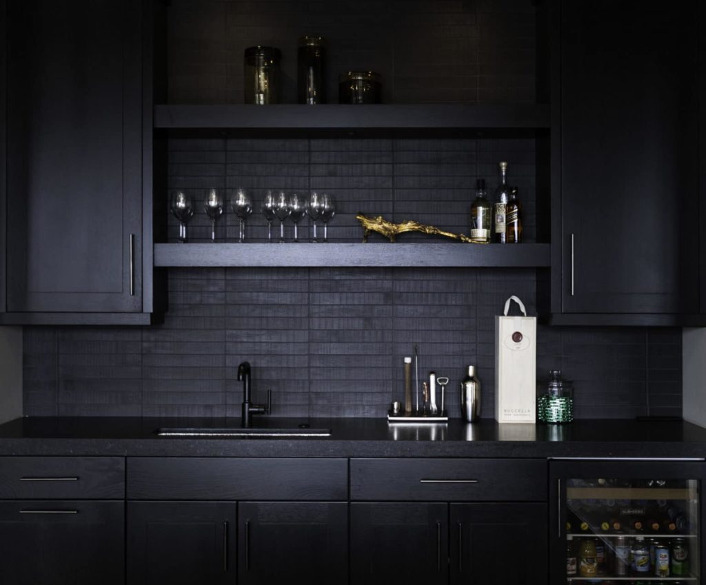
This wasn’t your first time using Native Trails products. There’s a sexy black wet bar where you used our Rio Chico sink in Brushed Nickel.
JC: That’s in Promontory, Utah, which is a cool development. It’s the client’s ski home. I’ve used your hammered nickel sinks a ton. They’re so pretty for bars. And I’ve used the Antique Copper vessel sinks. I don’t know if I’ve used any of the Murano glass sinks, but I want to. We’re doing another project that’s a guesthouse with a speakeasy inspiration, and we have some of your sinks in that, too. Again, this is why I think Native Trails is a perfect fit for a lot of what I do. We’re in Park City, so we have these mountain modern homes. This particular home was not quite as mountainy; it was a little bit more modern, but they still wanted some of those elements of metal or stone, to bring an earthy feel.
I’m hoping you can take us back to the beginning of your career. Because I imagine you didn’t start off with $24 million homes.
JC: Gosh, no. I did not. I started with my friends’ lockers in middle school. As a kid, I would push my furniture around in my room and rework the layout all the time. I would save wallpaper samples, fabric samples or little carpet samples. I even loved playing Barbies, just so I could decorate their house. I would take rubber cement and wrapping paper and wallpaper the dollhouse. When I got in college, the University of Utah, it took me a minute to land on design. But then I was like, “What am I thinking? I’ve always known what I love.” At the time, they had discontinued their interior design program, so they helped me put together a kind of a customized degree. I took all the remnants of the design program, and I took architecture and art history, but my actual degree is in environment and behavior. It’s from a little bit of a different take — it’s how your environments affect you, which I love because it’s really important to think about that. I started by doing a lot of floor displays for different retail stores. I even worked for Ethan Allen when I was in college. After I graduated, I freelanced a lot in Utah. I used to do a lot of model homes. They’re lower budget, but they’re fun. I have three kids, so when my kids were young, I would take different projects here and there. It was all word of mouth. When they were a little bigger, and in school, I was like, “Okay, now I get to focus on my career again. That’s when I went back to work full time and ended up joining Alder & Tweed, when they were a really, really new company. I was one of the first designers they hired. I helped them grow that business and was with them for almost 10 years. That was an awesome experience. It took me to a different level, gave me experience and some meatier projects. I’m so grateful for all the time I had there. But this time about a year ago, I was a little restless. I’m at this point in my life where I realized I still have a lot of time left to devote to my career. I’m a little more mellowed. Like, I still have it in me, but I’ve learned a lot of lessons. So I was like, “Okay, I can do this now.” I was ready to spread my wings a little bit and do things my way. We’ve had a great first year with Bond.
Your go-to paint colors?
JC: For whites, I love Swiss Coffee, Alaskan Skies and Bruton White by Benjamin Moore. Natural Choice from Sherwin Williams is a really good one. It’s a soft white — more of an off white but not yellow, not gray. I also love Tricorn Black, Roycroft Bottle Green, Agreeable Gray and Galveston Gray by Sherwin Williams.
What’s something people don’t understand about being an interior designer?
JC: You really have to be a good salesperson. You can’t just have talent at it. Because if you can’t communicate your ideas to people and get them to catch that vision, they’re not ever going to bite off on it. You have to be able to pitch your ideas and be passionate about it and stand your ground or push back a little when you know something is not going to work.
The other thing people don’t realize is how much work it is. It’s a hard job. You have to be super detail oriented. And you need to really treat people well, because you’ve got to get a lot of different people to come together, all the different trades. So a lot of it’s about relationships.
What’s your design philosophy?
JC: I really believe a good designer knows it’s not about them. You are hired to bring someone else’s vision to life, so check your ego at the door. I tell my clients all the time, “Give me your honest feedback. It’s not going to hurt my feelings. I just want them to be happy.
Favorite room in a house to design and why?
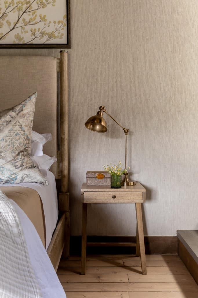
JC: I really love to do primary bedrooms. And I don’t always get to do that because a lot of people will make that a lesser priority. They want their showplace to be their great room or their living room or their dining room or the kitchen because that’s where they entertain. That’s where people come over and gather, and those are obviously really important spaces, too. But I love when people let me go for it in the primary because that’s your retreat, your sanctuary, your space. Even if nobody else sees that, that’s fine. It can be your little heaven away from everything.
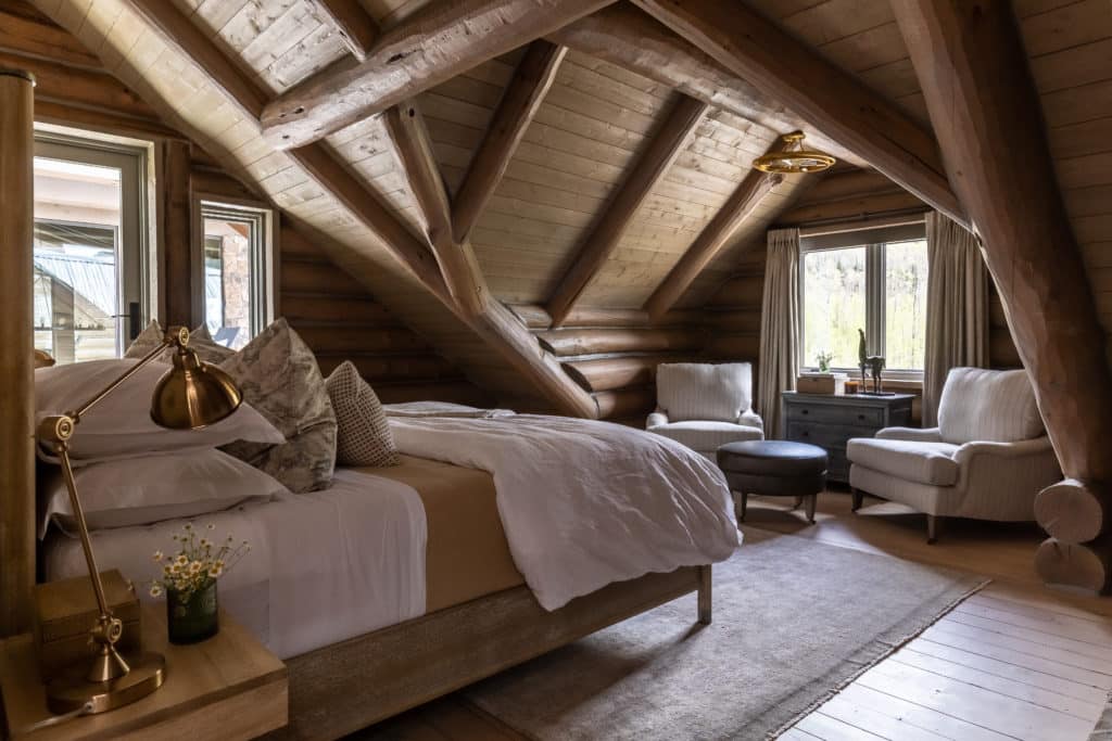
What does every bedroom need?
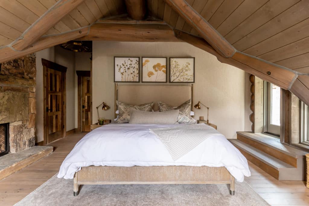
JC: I like a lot of layers, a lot of softness. It needs to a place that is tranquil. My favorite bedrooms are usually quite monochromatic because you get that really peaceful feeling. You go in there and go to sleep, so you want it to be serene.
What does every kitchen need?
JC: A place that people can kind of congregate, whether it’s around an island or somewhere else. Because even if it’s a small, you end up being in there, so you need a place where people feel like they can come and sit down and talk.
Who or what is inspiring you right now?
JC: What always inspires me is emotion. When I meet my clients, they are what inspire me. The feeling I get from them and their home, the emotion they portray to me. Sometimes you’ll get somebody and you can tell they’re full of energy and pumped for life. That energy and emotion is what inspires me on that project. Or I might have a different client who is wanting a vacation home, and saying, “We want this restful retreat from the world.” So, my clients are what inspire me. Their personalities and the emotion I feel from them.
Can you share three interior designers who inspire you the most?
JC: I really like the work of Kelly Wearstler. She does super cool things. I think she’s really pushed the limits, and she’s a boss. I also really like Martin Lawrence Bullard. His stuff is so intricately layered and super rich. It’s definitely a look that I don’t get to do a lot. Also, Mary McDonald. She is glamour but very classic. Beautiful, beautiful work.
Photography by Lindsay Salazar
