Meet the Design Psychologist Who Put a NativeStone Bathtub in Her Bedroom
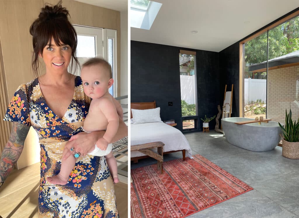
“If you’ve ever wondered if it would be ridiculous to put a tub in your bedroom, maybe I can help clear things up,” says Amber Dunford, art director for Overstock.com. “It is 100 percent ridiculous, and probably the coolest decision ever. Do it. Seriously.”
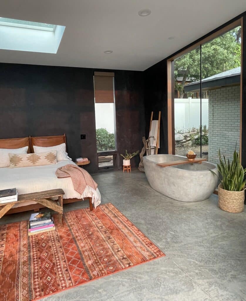
Amber caught Native Trails’ eye—and imagination—when during a recent remodel of her home in Salt Lake City, Utah, she installed a NativeStone Avalon concrete bathtub against a picture window in her bedroom.
With a background that spans set styling, home staging, interior design, and visual merchandising, including several years as Nordstrom’s environmental designer, Amber brings to the table not only her impeccable taste but a master’s degree in psychology.
What does psychology have to do with design? More than you might think. “I believe spaces are deeply linked to our emotions and contribute to our wellbeing,” says Amber, who has taught design psychology at Salt Lake Community College since 2010.
Here, she shares some of her tips and tricks for creating spaces that look and feel great.
Let’s start by talking about the renovations to your bedroom—and that bathtub!
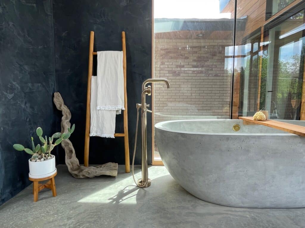
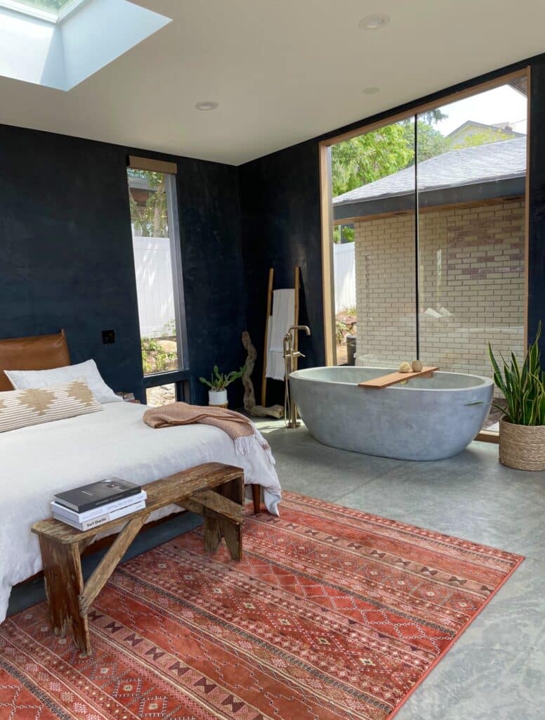
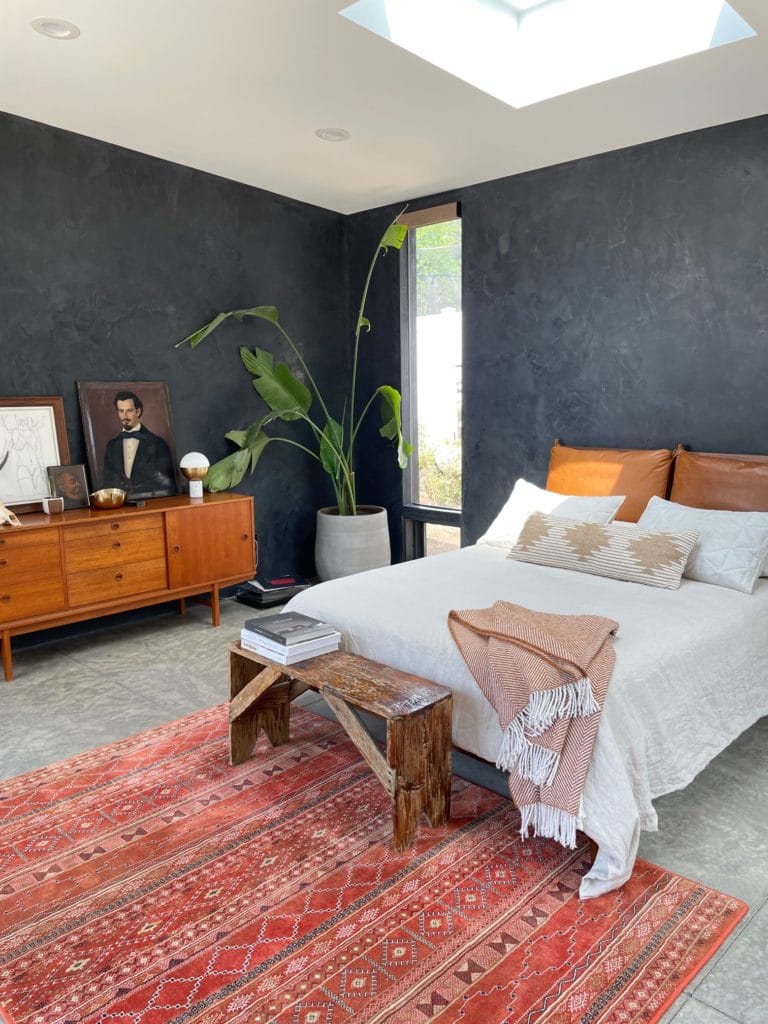
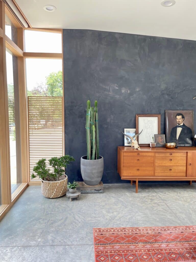
AD: We moved into the place a year and a half ago when I was seven months pregnant. And after a year of living in our bedroom, we started calling it the torture chamber—and not lovingly. Approaching the remodel, the first thing we decided on was having a bathtub in the bedroom. At first we picked out a more traditional ceramic tub, but when we sat with that for a minute, we knew something wasn’t feeling right. When we started looking into it, we found the Native Trails tub, which looks awesome with the floors. We wanted to keep it simple so we did a limestone wash on the walls and concrete slab flooring, and we have a little garden area just outside the window for when we’re in the tub.
On that note, what’s your take on the bathtub-in-the-bedroom trend? Apparently, you’re a fan.
AD: We had one in our old house, but it didn’t feel cool or on purpose. It just felt like they couldn’t fit the tub in the bathroom. But we loved it and knew we wanted to incorporate that vibe in this house, but in more of a modern way. I love the idea of baths being a ritual and part of self-care that is separate from the bathroom. You know, you get ready in the bathroom. It gets messy.
Yes, it feels more serene to have the tub in the bedroom. Especially because sleep doctors will tell you that the bedroom should only be used for two things: Sleep and sex.
AD: To have a bath is such a sensual thing, so it goes with both of those things.
You studied psychology in college and ultimately bridged that with your creative side. How did those two interests come together?
AD: I got my bachelor’s in psychology and then wasn’t sure what I wanted to do, so I went back to school for interior design. Then I stumbled on a single article about design psychology and was hooked. I stalked the author of the article, and she was super nice and said, “You probably need to get higher education in one area or another if you want to do this for a living.” At the time, they didn’t offer anything beyond an associate’s for interior design so I went on to get my master’s in psychology. I did private practice therapy and trauma work with kids for years. That was not happiness for me; it was breaking my heart. I loved what I knew, but I didn’t love being a therapist. So I went back to the college where I went for interior design and asked the director if she had any interest in infusing psychology principles into their courses. She called me back a week later and said, “I love the idea. I want you to teach a class about it in two weeks. It will need to be a 16-week course.”
Generally speaking, what do design and psychology have to do with one another?
AD: When you walk into a space, you immediately have a feeling, whether you recognize the feeling or not. Spaces have power over our psyche and our emotional wellbeing. They can make you feel at ease, they can make you feel anxious. My class basically teaches people how to tap into that—whether it’s their own attachments to space or their history with spaces in their childhood. From zero to five are your really formative years for attaching to another person; that is the blueprint for how you operate, and it colors how you attach to people in your adult life. But you can attach to space in the same way. Some people like to recreate chaotic spaces because they’re familiar with them, even though they know they’re not healthy. Or they want to recreate the smell of something or the way something felt or the view or the layout of a place—all of those things can evoke nostalgic memories that can feel really calming if you recreate them in your adult life. Then we open it up and explore some universal reactions to space and texture and color and materials, and how people respond. Like, I just read an article about how just being around woodgrain can reduce your stress levels.
What are some of the universal design truths that make people feel good?
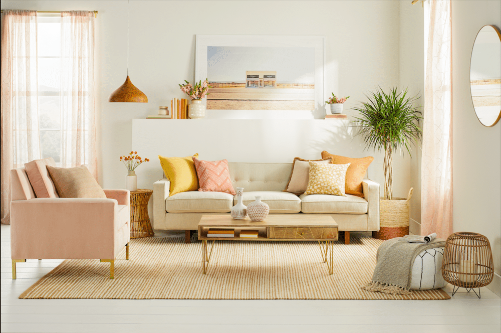
AD: We tend to feel more calm in monochromatic spaces, especially if they’re neutrals. All-white spaces make us tense; we feel more rigid and like we have to act more formal in them. But when I say monochromatic, I mean ranges of neutrals, maybe woodgrain and taupes and that family of off-whites, whites and creams. We feel really relaxed in those spaces. So even if you pick a single color—let’s say green—and you incorporate a really deep, vegetal green all the way to a chalky, watery green in the same room, we really like being in that versus in super high-contrast colors.
So color is probably the most important factor?
AD: Yes, and lighting. One of the biggest things with lighting is we like to be under dappled lighting, like the light that would hit through the trees on a sunny day. We like being around that fractured light, which is why a lot of people are doing those basketweave pendants. That’s a really good way to artificially replicate what you would find in nature. We have all kinds of baked-in preferences from our survival instincts; so if it was a sunny day, you knew that it was safe and you didn’t have to find shelter. We also don’t love being around too much print because it’s harder to spot danger. We scan it in the same way we would scan something on the savanna to see if danger’s approaching. That’s also why too much clutter makes us tense.
Are there certain principles you adhere to when creating kitchens?
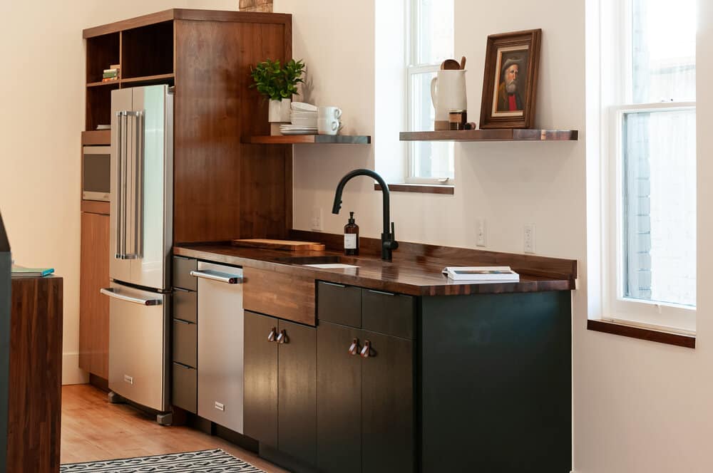
AD: With kitchens it’s about reducing the amount of clutter that you see, just because it is anxiety provoking to see a lot of things out. And I always think it’s nice to keep something like fresh and alive, whether that’s a basil plant or some other herbs. It’s also helpful to design kitchens with food colors. Blue is an appetite suppressant, so if you want to promote that in your kitchen, probably design with blue. There are just not a lot of blue foods in nature, but greens and warm tones are all nice to work with because they’re found in food.
How about for bathroom?
AD: In the bathroom I think it’s nice to think about textures. You start your day there and you end your day there usually. So it’s good to keep in mind things like plush towels or cozy rugs, things that hug you know and make you feel cozy.
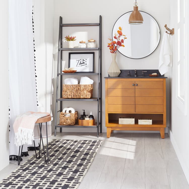
So do you have any go to bathroom paint colors?
AD: Personally, I like neutrals and colors found in rocks and plants. I feel better around earth tones and materials that feel derived from Earth, like concrete. Especially if you want your bathroom to feel like an escape or spa, I will definitely lean into nature. There’s a theory called shibui that says that nature never makes a mistake. With that, you would look around you to know not only the colors to use, but the distribution. For instance on a hillside, you would normally see browns and different ranges of oatmeals, and then you would maybe see just a little pop of a flower. So you know, smaller doses of color.
What do you put in every space that you design?
AD: Plants. I’m personally drawn to them, and it feels good to have something alive around you. They’re also just super good for creating oxygen in a space. And when we’re around plants we’re more creative, more open to conversation and tend to settle disputes faster.
How do you approach setting the art direction for an Overstock photoshoot or other freelance project?
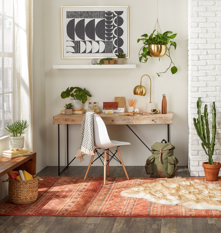
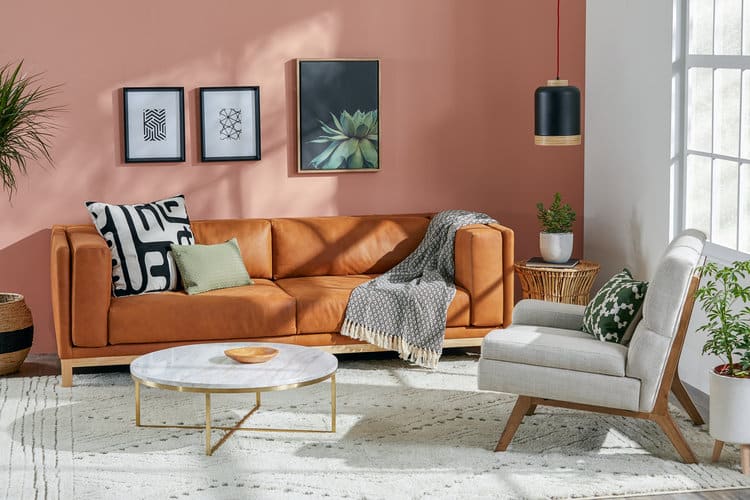
AD: Often there are trends, or seasonal references, that they want to go after. So I create mood boards that incorporate certain textures, colors, or trends happening in the industry. My work is a little different than interior design, where you would have your single client. I mean, I love thinking about how people use a space and how they’re going to interact with it, obviously. But as a career, I prefer styling. While interior design projects can go on for a year or more, I like that styling and art directing have a faster energy because it’s all part of planning for a photoshoot. With that, there are a lot of tricks and cool things done behind the scenes. Like if something’s not right, and we need to prop it up, we’ll shove an orange underneath it. Or sometimes a pile of garbage is all you need to push a pillow forward into frame a little bit more.
How do you envision your career evolving from here?
AD: I would love to continue doing design psychology, but on a bigger platform. Now that I’ve started teaching online during the pandemic, I’m a lot more comfortable teaching like this than I ever have been. I would also love to do design consulting for people outside of my hometown. Yeah, and there are probably more projects with my boyfriend in my future. We’re project people. We’ll continue to live here for a while, and then we’ll probably start over and do it all again.
All photography courtesy of Amber Dunford.
See more designs featuring in our Inspiration Gallery or read more about designers we love on our blog.
