Swedish Country Meets California Cool
Design Inspiration from Ulrica Wihlborg
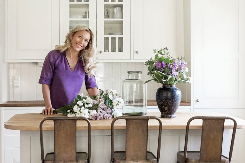
In 2012, Ulrica Wihlborg moved from Hollywood to a quiet coastal town in Sweden with her husband and three children. After 16 years of interviewing celebrities for People magazine cover stories, it was a big change. “I had to give up a career I loved for many years, and my circle of friends, and the year-around California sunshine,” says Wihlborg. “What ‘saved’ me was actually the planning of the interiors of our new home.”
The experience also helped Wihlborg cultivate and refine her design aesthetic and kept her connected to the world of media. Lonny profiled her first home in Sweden. Her second home there received an Architectural Digest feature.
Not one to rest on her laurels, Wihlborg became a yoga teacher and opened and designed her own studio. Subsequently, Domino named it the prettiest in the world! Recently, Wihlborg and her family returned to California where she reimagined a 1960s ranch home in the Pacific Palisades. The home (also featured in Domino) includes a Native Trails Farmhouse sink!
We sat down with Wihlborg to talk about her life, her career, and all things design.
NT: You’ve always been serious about interior design. You’ve even worked with a member of famed designer Kathryn M. Ireland’s team in 2012 when you moved to Sweden. Tell us about that project.
UW: I worked with design consultant Carol Ross on our first home in Sweden. She was a part of Kathryn M. Ireland’s team for a decade. A mutual friend introduced us. Working with her was an eye-opener. Carol taught me everything, from how to pick colors and patterns to the importance of beautiful roman shades and drapery. The house was small, around 1,200 square feet, so we had to maximize every single square foot. All while keeping the airy feeling. I had admired Kathryn for years and been invited to her home in Santa Monica many times. I just love her style so much. Carol totally got it, and it was an incredible learning experience for me. I would’ve never been able to do it without her.
NT: You spent an entire year working on the design of your home in Sweden while you still lived in L.A. How did you manage to organize and plan all of that?
UW: It was a tough decision to move from Los Angeles. I hadn’t lived permanently in Sweden since I was 16 so California was definitely my home. But I had three kids under the age of 5, and we really wanted life to be simpler and quiet. We had bought a small house in Sweden two years earlier, so we decided to pack up and move! It was pretty scary. [The design] process was truly a gift, because it helped me prepare for this huge shift in my life. It also gave me a lot of time to carefully choose every single piece for the home. Everything I chose was something I truly loved.
We had a floor plan early on, so it became a process of finding pieces that fit into the floor plan. It was like putting together a puzzle. I spent many hours driving around Southern California looking for furniture, fabrics for roman shades and custom pieces, and everything else you need to create a home.
“The house, which had originally felt foreign to me, suddenly felt like home. It was as if my cherished life in California enveloped me in a gigantic hug, and merged it with my new life in Sweden.”
Two days before we boarded the plane, we shipped the entire house interiors in a container from LA to Sweden. When it arrived a few weeks later, my family — parents, grandparents, cousins—came together to help us unload the truck. They helped place each piece in its designated spot according to the floor plan. It all fit perfectly, and within hours I had the home I had spent so much time envisioning and planning. Every single detail, the furniture, lamps, pillows, window treatments, all the pretty little accessories …. it all came together beautifully in that one day. It was almost like magic! That night, as I tucked my kids into their new beds, I knew planning the interiors from afar was one of the best decisions I’d ever made. The house, which had originally felt foreign to me, suddenly felt like home. It was as if my cherished life in California enveloped me in a gigantic hug, and merged it with my new life in Sweden.
NT: You recently made your return to LA, for part of the year, when you purchased a home in Pacific Palisades. What made it the house for you?
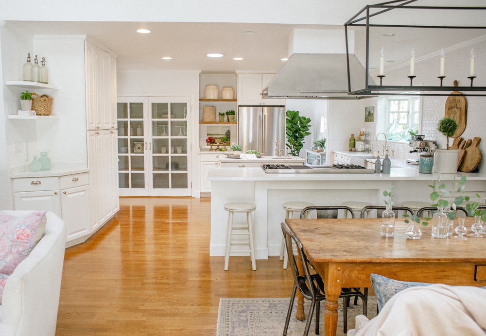
UW: The house is a signature early California Ranch built in 1964 with a pitched roof. When we first saw it, it had been neglected for years and stripped of a lot of its charm and architectural details. But it had great, pretty lines, a lovely indoor-outdoor flow and lots of sunlight. We fell in love with it the first time we stepped inside, and the location was perfect. It sits on the coast right between Santa Monica and Malibu. You can feel the ocean breeze when you open the windows. We decided to simply embrace its architectural style, fine-tune its lines and bring it back to its original glory—or better! We wanted subtle changes that still made a big difference. The bones were already there, so the goal was to simply preserve the character of the house while thoughtfully updating it in an eco-friendly way.
NT: What was it like designing this home on your own?
UW: Designing the Pacific Palisades house on my own was not something I had planned to do! Carol had moved to Hawaii, so it became tricky to get a hold of each other. She initially helped me with the floor plan and the interior paint colors, but then I continued on my own. At first it was hard to make decisions, because it’s nice to have someone you trust telling you if it’s going to be ok or not! And some of these decisions are big and permanent, like the exterior house color, so you don’t want to make a mistake. Finally I had to just trust myself and go with it. And the more decisions I made, the easier it got.
NT: You describe your style as “Swedish country meets California cool.” Tell us what the key ingredients are.
UW: I like simplicity, and Swedish design is overall very clean and monochromatic. I like how unpretentious it is, and of course, white is big. There’s not a lot of room for clutter or texture or crazy color combinations. But that’s also a challenge, because it tends to hold me back from making more brave choices in terms of design. California design, on the other hand, has so much more texture and brings in influences from many different cultures. But it still has that same light, relaxed feel. Both styles share a love of natural materials, like rustic wood, metal and thick linens. It makes for a home that’s beautiful and light, yet functional and warm. So my goal was to merge the clean and simple lines of Swedish design with the more textured feel of California design, and create an airy home that would work for a family with small children.
“The design of this home was about style, but it was also about heart.”
The design of this home was about style, but it was also about heart. I wanted to mix beauty with quirky objects, focusing on choosing natural eco-friendly materials. From furniture and art pieces picked up at Swedish flea markets to beautiful Raoul Textiles fabrics to linen couches to weathered wood, it was all about creating a space made for happy days and easy living.
NT: We want to know everything about your kitchen remodel.
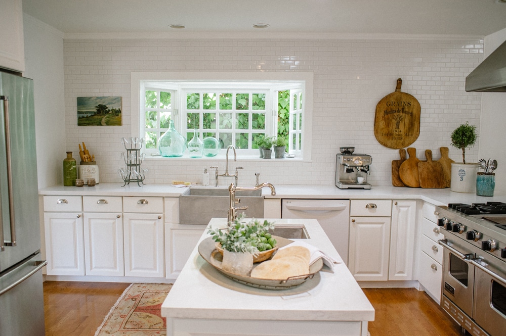
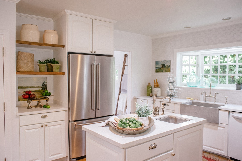
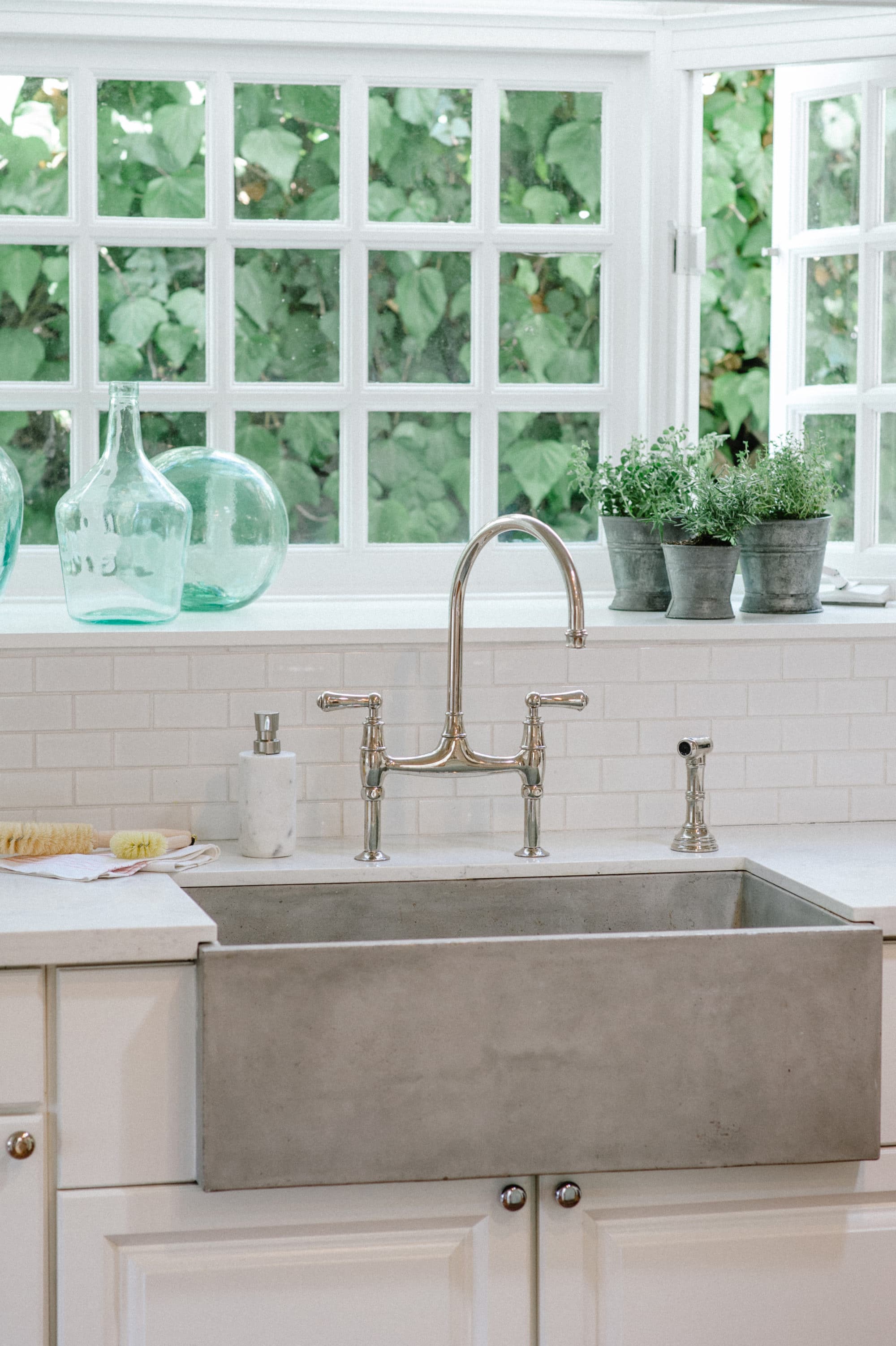
UW: The kitchen was one of the biggest changes. Farmshop, the restaurant at the Brentwood Country Mart, inspired the design. The existing cabinets weren’t my dream cabinets, but it felt wasteful to replace them since they were made of wood and they were in great condition. So we pulled down the upper cabinets and installed basic 2×3 subway tile, painted the lower cabinets Benjamin Moore Simply White and replaced all the hardware with Rejuvenation’s Massey bin pulls. We also replaced all the countertops with Titan Quartz in Calacatta Venezia. But the biggest design element in the kitchen is the Native Trails farmhouse sink. I had pinned the sink on Pinterest a few years ago because it was so beautiful and unique. So that sink was a must-have for me.
“The entire kitchen is basically white, from floor to ceiling. So the sink not only provides a focal point, but brings in much needed texture. And I love that it’s made of jute and cement, because it goes with the eco-friendly design of the home.”
We centered the sink so it sits right in the middle of those pretty bay windows, and when you enter the kitchen that’s the first thing you see. The entire kitchen is basically white, from floor to ceiling. So the sink not only provides a focal point, but brings in much needed texture. And I love that it’s made of jute and cement, because it goes with the eco-friendly design of the home. And with three small kids, that sink is not only gorgeous but it’s so functional! It really “makes” the entire kitchen.
NT: Having been a part of the media, do you have tips for people who’d like to get their home featured in a shelter magazine or top home design site?
UW: I highly recommend hiring a publicist if you are doing a large project and you really want to get it published. Otherwise, style your home with flowers and decor, and hire a great professional photographer who knows how to shoot interiors. It’s easier if you can provide publications with editorial-style photographs when you try to get your home featured. Also, most publications want the home as an exclusive first-look, so don’t post everything on Instagram before publication date!
NT: With three kids, do you worry about keeping your designs kid-friendly?
UW: Everything from the slipcovered sofas to pillows to rugs can be cleaned or thrown in the laundry machine. Also, almost all of the wood furniture pieces I chose turn more beautiful with age. I tend to personally like things that are washable and rustic. Things get dirty, even without kids, so I try to design a home that can withstand the occasional spill or crayon! My kids are 6, 8 and 11, and they don’t have access to any technology apart from one TV that we try not to use too much, so there are tons of forts being built at all times. It can get a little crazy, but they can use everything in the house as long as they clean up after themselves. So everything is washable, and basically everything is kid-friendly. And if I have too many pillows and blankets, now you know why!
NT: Do you have any go-to styling secrets for photoshoot day?
UW: My advice is to bring in flowers in every room. Keep the colors monochromatic, using simple flowers or leaves like peonies, garden roses and eucalyptus. And add a little “living” so the rooms don’t look too perfect, such as a pair of pretty shoes or a purse or some details that tell the story of the people living in the home.
“If you choose to design your home around things you have a connection with, not just something you’ve seen in a magazine, then you have created a home that is a true reflection of you. And you’ll love it for a long time.”
NT: What is your definition of home?
UW: When you’re surrounded by things you have spent time with, or chosen because you love them, or have a sweet story attached to, that makes a real difference. If you design your house around those premises, you will create a space you don’t need to change all the time, no matter what the latest trend tells you to do. I really believe in choosing design you can live with for a long time, and grow with. If you choose to design your home around things you have a connection with, not just something you’ve seen in a magazine, then you have created a home that is a true reflection of you. And you’ll love it for a long time.
Photography by Heidi Zumbrun
Styling by Eden Rodriguez
