In Conversation with Farmer’s Daughter Interiors Founder Kelsey Grose
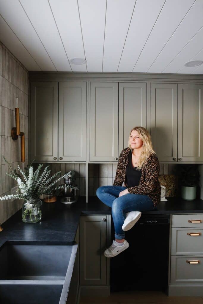
In the summer of 2020, Kelsey Grose, founder of Farmer’s Daughter Interiors, moved into what was once her grandmother’s house on her family’s farm south of Swift Current, Saskatchewan. But first, she had to renovate it, with a newborn in her arms and a toddler underfoot nonetheless. “I call it a farmhouse because it’s on a farmyard, but really the house was built in 1964 and has more of a mid-century vibe than what you think of when you hear ‘farmhouse,’” she says. “I grew up spending tons of time in this home with my grandma and some of my fondest memories are picking peas out in the garden with her, baking cookies sitting up on the counter, and sleepovers when she let us have ice cream and homemade chocolate sauce before bed. She is such a woman of faith and character and I always say if someday I end up to be half the woman she is, I will be lucky. To be able to give her house a new lease on life feels so good and I know it’s ready now for another batch of fresh memories.”
Kelsey’s self-written design blog, on which she recently detailed the ins and outs of her remodel, was named 2017’s Best New Design Blog by the Design Bloggers Conference in Los Angeles. Her work has also been featured on Apartment Therapy, The Haven List, Scout & Nimble, The Identite Collective, Country Living online and others.
We’re enchanted by the fact that this house was once your grandma’s. How did you end up calling it your own?
KG: I grew up on the grain farm that the house sits on, hence the name Farmer’s Daughter. So I am truly a farmer’s daughter. My mom had some farm laborers living in the house, and when they decided to move out, it was sort of short notice, like, “Hey, do you guys want the house? Or should I turn around and rent it out again?” We had to decide, “Wait, do we want it? Yeah, we do. Okay, we’ll take it.” We had been living in our local city, Swift Current, for eight years since we were married, my husband and I. Then we had our first son in 2019. And even though we had always wanted to be in the country, we had no plans to ever live in that house. When we decided to list our house and pack everything up and move out to my grandma’s house in the country, it was mostly because our boy was two at the time and was wanting to be outside like every waking second. It’s not a big house. It’s no bigger than the one we were in before. It’s cozy, so it’s somewhat easy to keep on top of. But there’s a huge yard and a big farm garden and so much room for him to be outside.
How did you approach the renovation?
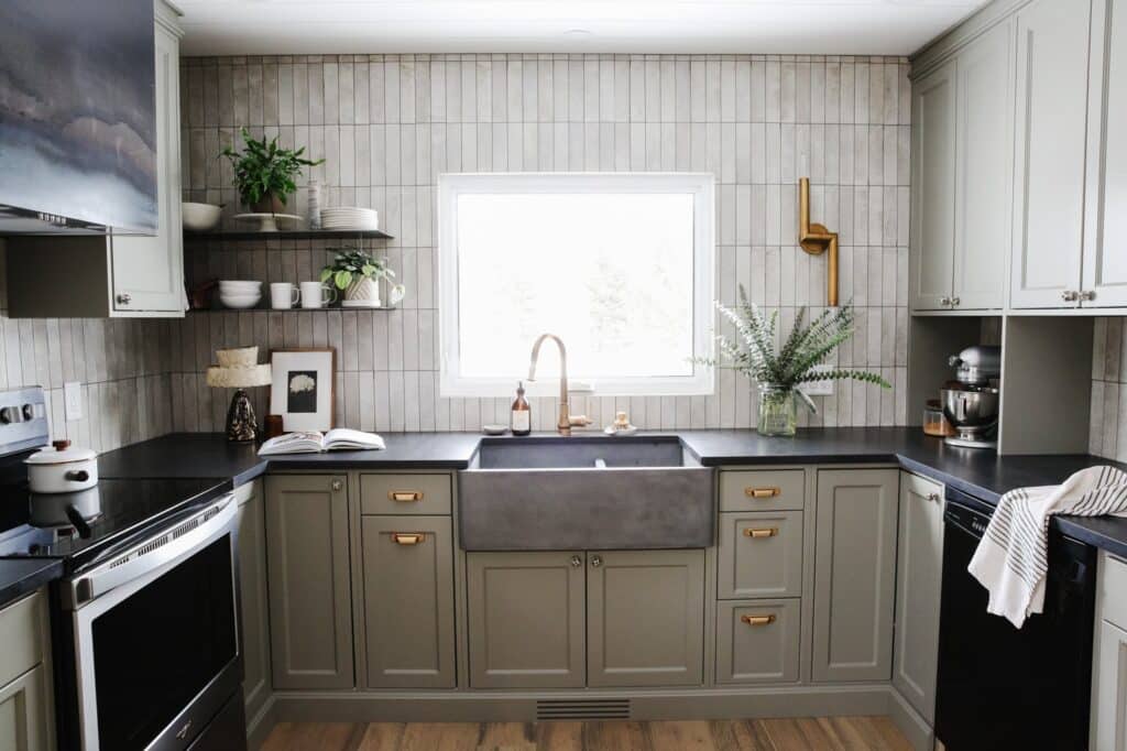
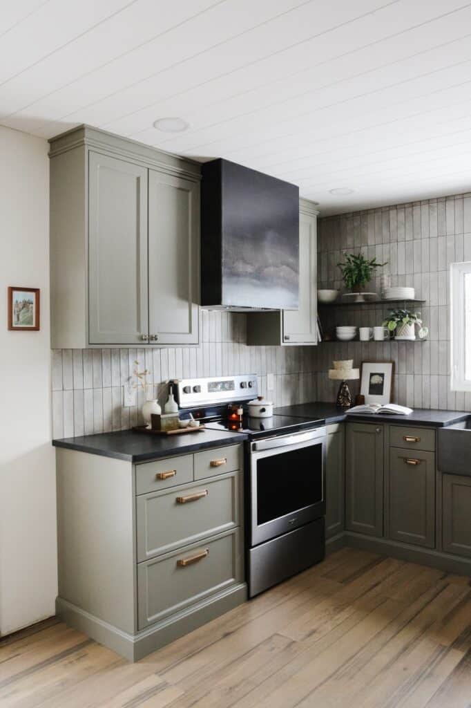
KG: We started a couple months before we had to move in. Then we moved in but with no kitchen. I had my baby, our daughter, two days later. Hopefully I never have to do that again because that wasn’t very wise. But we made it. I knew I wanted to create a moody vibe in this kitchen — something that didn’t scream farmhouse but had elements of that look while pulling in a slight nod to midcentury design. We painted the entire house “White Dove,” my favorite white by Benjamin Moore; that made a huge difference. We also switched out some of the lighting and did the flooring in most of the house. We did the bathroom upstairs as well as the main floor bathroom. The bathrooms and the kitchen were the big projects. It took a little longer than I’d hoped to get the renovation done, too. But we had a newborn and a toddler, and my husband was doing a lot of the work himself.
Speaking of paint colors, what is that divine color you chose for the kitchen cabinets?
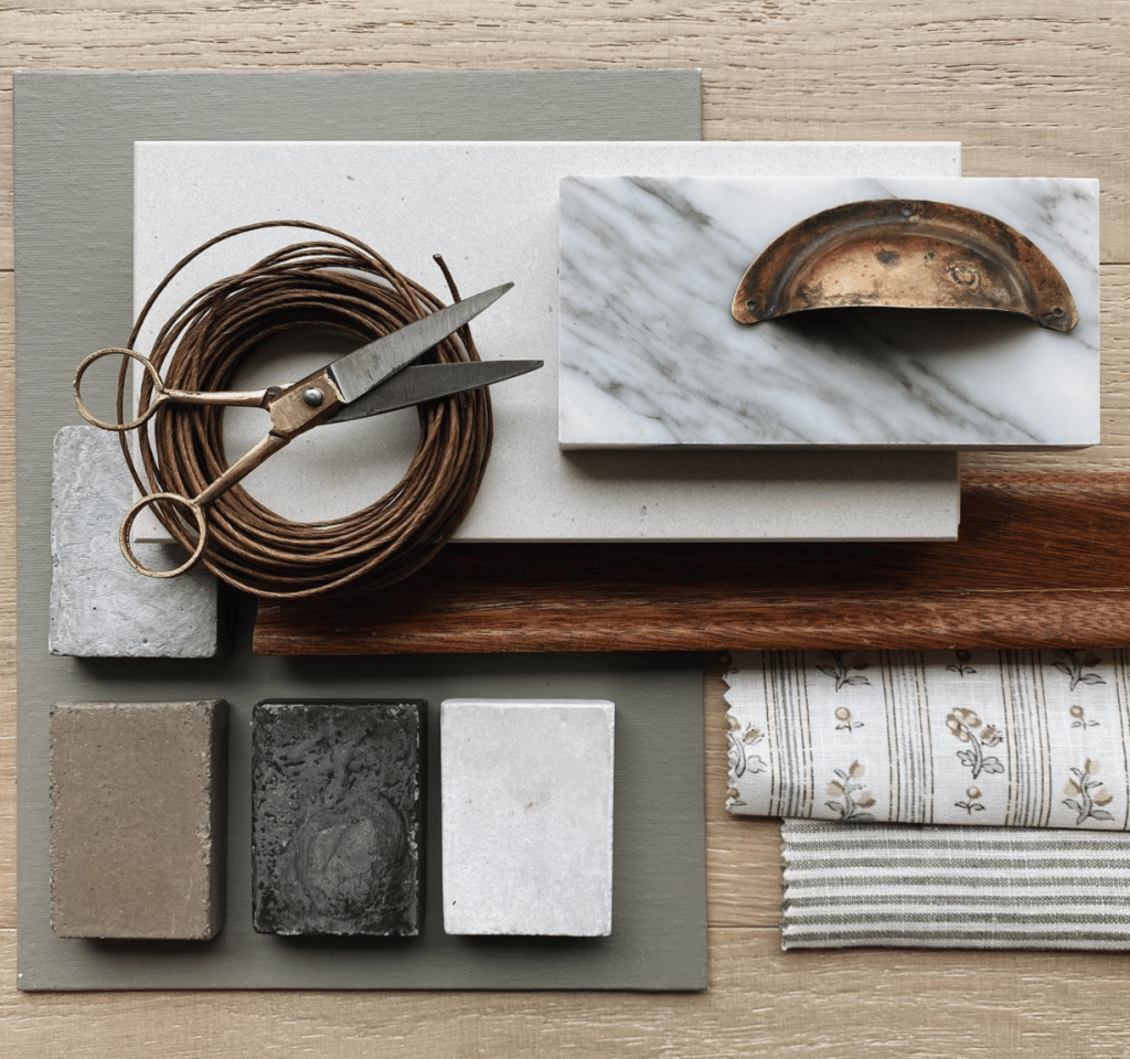
KG: I get asked about that one a lot. It’s “Desert Twilight” by Benjamin Moore and looks more green in some lights and more gray in others. I was originally thinking of a deeper green, but because the kitchen is so small, I didn’t want it to feel too dark.
How was it different to work on your own home compared to working with a client?
KG: I think I’m my worst client I’ve ever had. When it’s your own house, anything goes. And when you’re in the design industry, you know all the options out there, but you don’t have someone to cull them down for you. Because that’s our job as designers, right? We sift through all of it and just present a couple of options. But when I’m working on my own stuff, the options are endless and no one narrows them down. I find I can really waffle, go back and forth, but eventually I just have to pull triggers and get it done.
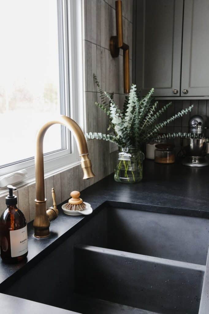
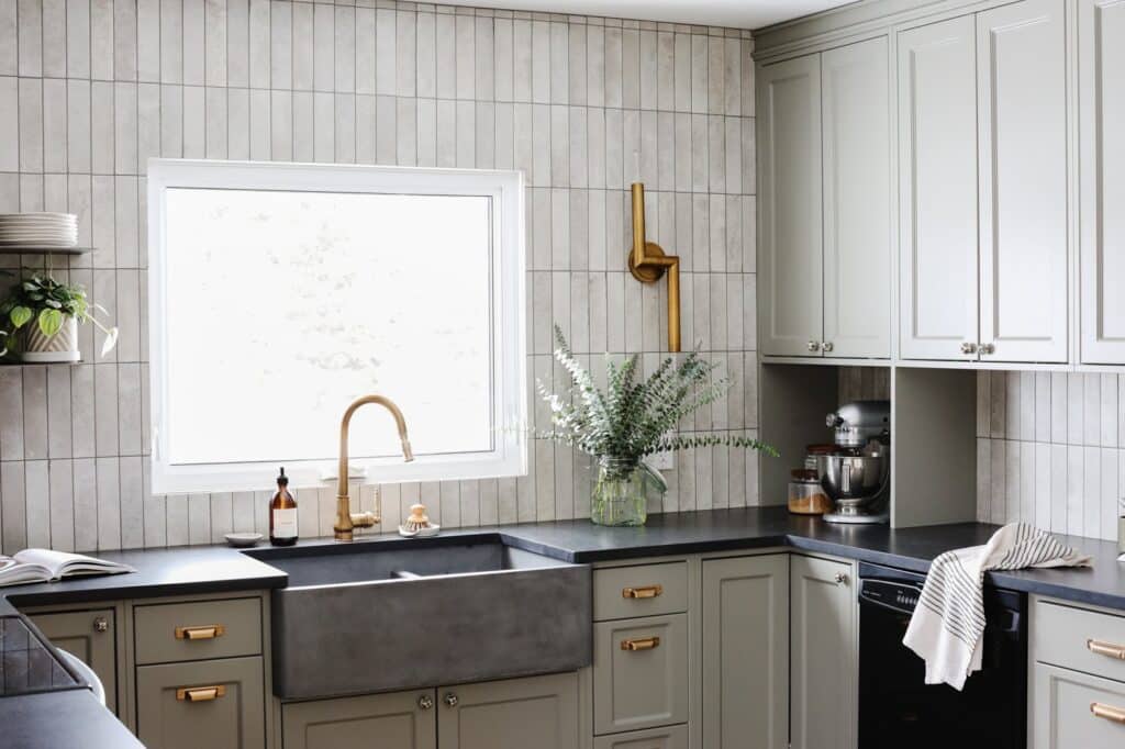
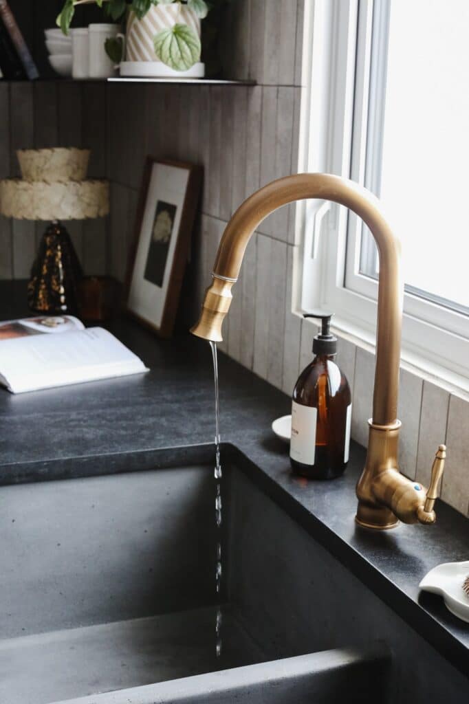
Knowing you had all the options in the world makes it that much more special that you selected our NativeStone Double Bowl Farmhouse sink for the kitchen. I know you also have one of our NativeStone bar sinks in your design studio.
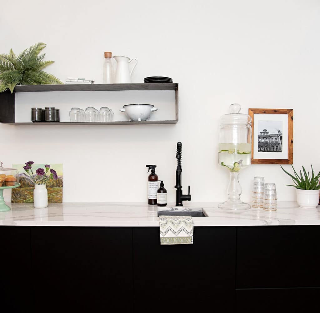
KG: Yes, I was really, really drawn to your concrete product. It’s so different and so tactile. Especially in our area, everyone does the more standard materials as far as kitchen sinks go. I felt like I had to try NativeStone, see how it stood up and how durable it was before I could really recommend it to clients. So, yes, we have your 15-inch Ventana bar sink in our studio, and it’s been great. Just from using it, I was confident enough that I could recommend it to clients. We had a client just do the same sink that I did — the 33-inch Farmhouse Double Bowl — in her kitchen and she said she really likes it. She also did your Avalon bathtub in the Earth color. It’s beautiful. I was asking her all about it, like how does it sit? And does it like hold the warmth of the water? She had great feedback on it.
Well, tell us how are you enjoying your sink and kitchen so far?
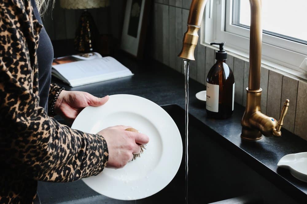
KG: Right from the very initial planning stages I knew I was eyeing a Native Trails sink for this kitchen. Ours is the Slate finish, and it has a beautiful slight variation in the color, which you can especially see on the apron front. It’s nice and deep to hide dirty dishes and make washing a breeze, and the finish comes pre-sealed and is standing up beautifully. Absolutely my favorite thing in the kitchen!
How would you describe your design aesthetic in a few words?
KG: Warm, approachable, prairie and practical.
What is your favorite room to design at a house and why?
KG: Lately, kitchens and bathrooms. Because we are in those rooms all the time, and they can be so dysfunctional. There’s nothing I love more than taking areas that are such hardworking spaces in the home, making them functional and adding in unique features that can really change the life of our clients. When you consider morning and evening routines, you can see that it’s life-changing to renovate your kitchen or your bathroom. So I really love working on those spaces.
Do you have some go-to things that you do to make a kitchen or bathroom more functional?
KG: It’s different in every kitchen; we put a lot of time into an interview process on the front end, before we even start doing any design work with our clients, to really get to know them and figure out not just who’s using the space but how are they using it? Even questions like, What’s your breakfast routine? Are you coffee drinkers? Do you do wine in the evenings? Really dialing into who they are as people or as a family, and then taking that information and letting that dictate our design work.
What is something that people don’t realize about what it’s like to be an interior designer?
KG: It’s that it’s 80% business and 20% design work. It’s so much on the business end, whether you’re a solopreneur or whether you have a team that you’re managing. You’re wearing all the hats, you’re doing the marketing, and you’re doing the HR and the PR. The times when you get to actually do real design work are really special, because it’s so heavy on the business side.
What does living well mean to you?
KG: It means being comfortable in your home. It’s a safe, secure place for your family, but it also brings you joy and happiness and fulfillment and rest and all the things that we’re asking our homes to do more and more these days. We want our homes to be that refuge from the outside world, so I think living well is when your home is that for you.
What does every kitchen need?
KG: Well-placed lighting and natural lighting. I mean, not every kitchen can have natural lighting, but most of them do. That’s something I’ve seen a lot of kitchens is just a lack of lighting or lack of well- placed lighting. And I think it’s a game changer for sure. No matter what your kitchen looks like, or how big or how small, if the lighting isn’t placed properly, and it’s not functional for you, that’s an issue. So yeah, every kitchen needs well placed well-place lighting — and a pull-out garbage can.
Who or what is inspiring you right now?
KG: Usually my answer to this question would be travel. I love to travel. And I’ve done quite a bit of it, especially before I was married, to Europe and places like that. I always find that incredibly inspiring. But since the pandemic I just haven’t been able to get away as much, so I’ve been looking to our prairie landscape for inspiration. We’re really surrounded by nature here and so integrated with the prairie landscape with our farming community here. The way our weather patterns are, we have skies that are unrivaled in terms of sunsets and sunrises. Especially our prairie grasses — we get four distinct seasons here, so the colors really change from bright green in the summer and then they really wash out in the fall. But even in winter, I find sometimes just looking outside, the color palettes are right there.
Are there a few interior designers who particularly continue to capture your interest?
KG: I’ve been watching Heidi Caillier lately. She’s in Seattle. She is using a lot of bold, deep color in a way that is so approachable. And Lynda Gardner; she’s a stylist in Melbourne. She’s got a way of making spaces feel like very, very rustic, but still very refined and balanced at the same time. She uses a lot of high contrast darks and lights. And I just find everything that I see from her really inspiring and different. I just came across Alice Grace Interiors the other day. She’s in the U.K. I just found out she’s based in Bath, which is such a gorgeous city. She does very English interiors. And I’m loving that too. I find them so interesting to look through. They’re very detailed, the colors are so deep, and it always feels so cozy.
Photography by Delina Langridge
Cabinetry: Richard Erb at Rockside Builders
Countertops: Caesarstone’s Black Tempal
Tile supply: NuWest Interiors Swift Current
Design + styling: Farmer’s Daughter Interiors
Accessories: The Home Quarter Shop
See more designs in our Inspiration Gallery or read more about designers we love on our blog.
