Jim Howard: Drawing from Art and Architecture

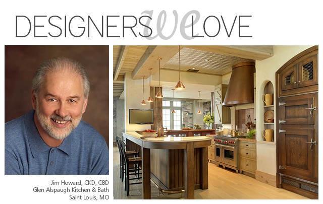
Jim Howard, a leading designer at Glen Alspaugh Kitchen and Bath for over 22 years, gains his distinctive design style from his formal training in fine arts and architecture. As well as a background in construction and millwork. This distinguishing combination of creativity and technical ability shows in his projects, as well as in his design process. Jim creates designs that are not only beautiful, but reflect his clients’ personal sense of style and accommodate their lifestyle.
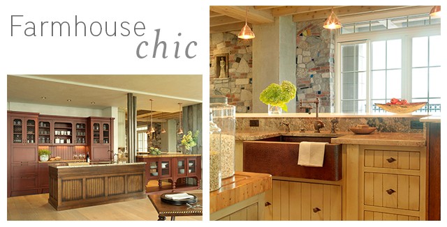
NT: Jim, we’ve been fans for years. We first came across your work when you used our 33” copper farmhouse sink in your Farmhouse Chic kitchen. Which ultimately won the prestigious NKBA Pinnacle of Design Award in 2010. In your NEW Old World kitchen, you’ve created a breathtaking update to a traditional design. Tell us about the design challenge.
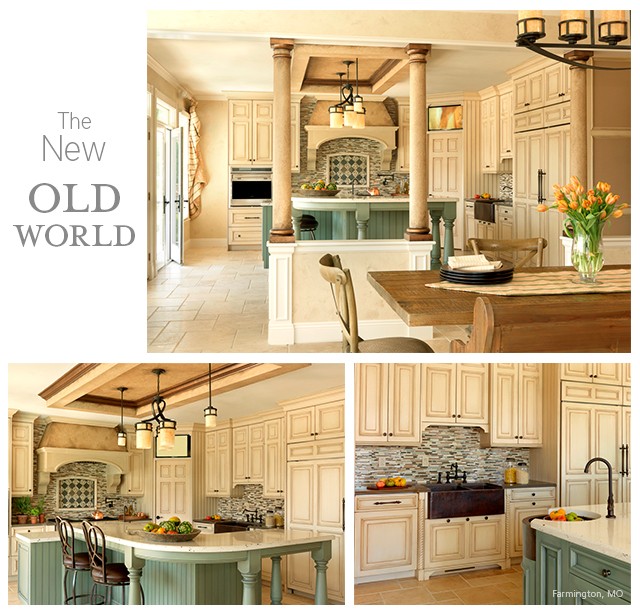
JH: The project involved converting a dining room addition into a kitchen. So essentially we started with a blank slate, which can be very challenging. Since the homeowners had an extensive appliance wish list but still wanted an open plan, the large island became an anchor for the kitchen. The island facilitates traffic flow, maximizes function, and takes advantage of the light and view provided by the wall of French doors opening to the pool area. The soffit above reinforces the island shape, further anchoring the large kitchen space.
NT: What is your favorite aspect of the project?
JH: The use of the Native Trails Fiesta sink. We used the curved copper apron front to round the corner of the island, so the cabinetry curves along with the sink. It’s a very neat detail, and required a lot of careful planning to pull off.
NT: We were, in fact, blown away by the effect that you created with this truly creative placement of the round apron sink incorporated into the corner of the island. It is quite an eye catching statement. You also used our Farmhouse Duet Pro copper apron sink. Can you tell us what led you to selecting Native Trails copper sinks for this project?
JH: The idea was to juxtapose worn, antiqued elements with shiny, modern elements to create a look that transcends time. Copper was one of our antiqued elements. The hammered texture adds interest, and the antique finish is a very natural, grounding color; it worked well with our earth-tone color palette.
NT: The palette definitely reflects an update to the traditional Old World style, as do the columns. Tell us about their incorporation into the design.
JH: The half wall and columns between the dining room and the kitchen are actually where an exterior wall used to be. They had to be included to provide structural support since the homeowners wanted the kitchen open to the dining room for entertaining.
NT: Was there any particular source of creative inspiration?
JH: My inspiration always comes from my clients. They bring me their ideas and their wish lists, and we try to figure out what will work best with the space to give them what they want.

See more of Jim Howard’s award winning designs by visiting: https://glenalspaughkitchens.com/portfolio/


